How to deal with CSS responsiveness in Wordpress
Issue #283
Original post https://medium.com/fantageek/dealing-with-css-responsiveness-in-wordpress-5ad24b088b8b
During the alpha test of LearnTalks, some of my friends reported that the screen is completely blank in search page, and this happened in mobile only. This article is how I identify the problem and found a workaround for the issue, it may not be the solution, but at least the screen does not appear blank anymore.
As someone who likes to keep up with tech via watching conference videos, I thought it might be a good idea to collect all of these to better search and explore later. So I built a web app with React and Firebase, it is a work in progress for now. Due to time constraints, I decided to go first with Wordpress to quickly play with the idea. So there is LearnTalks.
The theme Marinate that I used didn’t want to render the search page correctly. So I head over to Chrome Dev Tool for Responsive Viewport Mode and Safari for Web Inspector


The tests showed that the problem only happened on certain screen resolutions. This must be due to CSS @media query which display different layouts for different screen sizes. And somehow it didn’t work for some sizes.
[@media](http://twitter.com/media) screen and (max-width: 800px) {
 #site-header {
 display: none;
 }
}
A bit about the rules
The @media rule is used in media queries to apply different styles for different media types/devices.
Media queries can be used to check many things, such as:
width and height of the viewport
width and height of the device
orientation (is the tablet/phone in landscape or portrait mode?)
resolution
Using media queries are a popular technique for delivering a tailored style sheet (responsive web design) to desktops, laptops, tablets, and mobile phones.
So I go to Wordpress Dashboard -> Appearance -> Editor to examine CSS files. Unsurprisingly, there are a bunch of media queries
[@media](http://twitter.com/media) (min-width: 600px) and (max-width: 767px) {
 .main-navigation {
 padding: 0;
 }
 .site-header .pushmenu {
 margin-top:0px;
 }
 .social-networks li a {
 line-height:2.1em !Important;
 }
 .search {
 display: none !important;
 }
 .customer blockquote {
 padding: 10px;
 text-align: justify;
 }
}
The .search selector is suspicious display: none !important;
The important directive is, well, quite important
It means, essentially, what it says; that ‘this is important, ignore subsequent rules, and any usual specificity issues, apply this rule!’
In normal use a rule defined in an external stylesheet is overruled by a style defined in the head of the document, which, in turn, is overruled by an in-line style within the element itself (assuming equal specificity of the selectors). Defining a rule with the !important ‘attribute’ (?) discards the normal concerns as regards the ‘later’ rule overriding the ‘earlier’ ones.
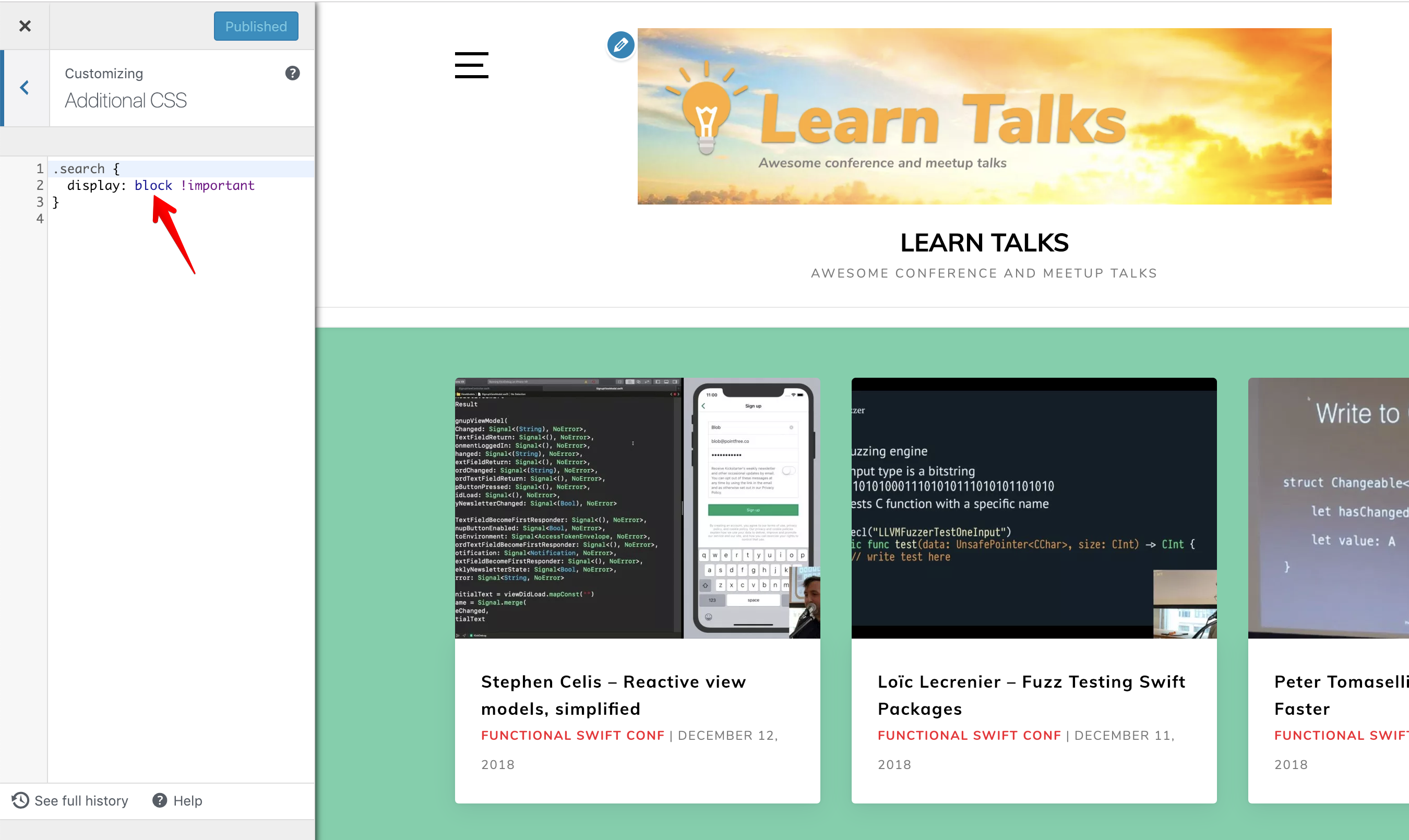
Luckily, this theme allows the ability to Edit CSS , so I can override that to a block attribute to always show search page
