How to use ViewBuilder in SwiftUI

Issue #767

SwiftUI ‘s ViewBuilder is a custom parameter attribute that constructs views from closures.

It is available in body and most SwiftUI modifiers

1
2
3
4
5
6
public protocol View {
associatedtype Body : View
@ViewBuilder var body: Self.Body { get }
}

public func contextMenu<MenuItems>(@ViewBuilder menuItems: () -> MenuItems) -> some View where MenuItems : View

In these ViewBuilder enabled places we can perform conditional logic to construct views. For example here in our SampleView, we have switch statement in body

1
2
3
4
5
6
7
8
9
10
11
12
13
14
15
16
17
18
19
20
21
22
struct SampleView: View {
enum Position {
case top, bottom, left, right
}

let position: Position

var body: some View {
switch position {
case .top:
Image(systemName: SFSymbol.person.rawValue)
default:
EmptyView()
}
}

var profile: some View {
if true {
return Image(systemName: SFSymbol.person.rawValue)
}
}
}

ViewBuilder applies to both property and function. If we want to have the same logic style as in body in our custom property or methods, we can annotate with ViewBuilder. This works like magic, SwiftUI can determine the types of our expression.

1
2
3
4
5
6
7
8
9
10
11
extension SampleView {
@ViewBuilder
func profile2(position: Position) -> some View {
switch position {
case .top:
Image(systemName: SFSymbol.person.rawValue)
default:
EmptyView()
}
}
}

Use ViewBuilder to construct View

We can use ViewBuiler as our parameter that constructs View. For example we can build an IfLet that construct View with optional check.

1
2
3
4
5
6
7
8
9
10
11
12
13
14
15
public struct IfLet<T, Content: View>: View {
let value: T?
let content: (T) -> Content

public init(_ value: T?, @ViewBuilder content: @escaping (T) -> Content) {
self.value = value
self.content = content
}

public var body: some View {
if let value = value {
content(value)
}
}
}

With ViewBuilder we can apply logic inside our closure

1
2
3
4
5
6
7
8
9
10
11
12
13
struct EmailView: View {
let email: String?

var body: some View {
IfLet(email) { email in
if email.isEmpty {
Circle()
} else {
Text(email)
}
}
}
}

Use ViewBuilder where we can’t use closure

In some modifers like overlay, SwiftUI expects a View, not a closure that returns a View. There we cannot use additional logic

1
2
extension View {
@inlinable public func overlay<Overlay>(_ overlay: Overlay, alignment: Alignment = .center) -> some View where Overlay : View

The below won’t work as we can’t do conditional statement in overlay modifier

1
2
3
4
5
6
7
8
9
10
11
12
struct MessageView: View {
let showsHUD: Bool

var body: some View {
Text("Message")
.overlay(
if showsHUD {
Text("HUD")
}
)
}
}

But we can make something like MakeView that provides a ViewBuilder closure

1
2
3
4
5
6
7
8
9
10
11
public struct MakeView<Content: View>: View {
let content: Content

public init(@ViewBuilder make: () -> Content) {
self.content = make()
}

public var body: some View {
content
}
}

So we can use a conditional statement in any modifier that does not accept ViewModifier

1
2
3
4
5
6
7
8
9
10
11
12
13
14
struct MessageView: View {
let showsHUD: Bool

var body: some View {
Text("Message")
.overlay(
MakeView {
if showsHUD {
Text("HUD")
}
}
)
}
}

How to simplify communication patterns with closure in Swift

Issue #744

As someone who builds lots of apps, I try to find quick ways to do things. One of them is to avoid repetitive and cumbersome APIs. That’s why I built Anchors to make Auto Layout more convenient, Omnia to add missing extensions. The next thing in the itchy list is the many ways to communicate among objects in iOS and macOS development that can be very annoying sometimes.

This post is my take on tackling some communication patterns issue and how to make it simpler with EasyClosure. The learning applies for both iOS and macOS development, and code is in Swift 5.

Table of Contents

The many communication patterns

In iOS, we can handle button tap by using addTarget which is a function that any UIControl has:

let button = UIButton()
button.addTarget(self, action: #selector(buttonTouched(_:)), for: .touchUpInside)

@objc func buttonTouched(_ sender: UIButton) {}

In macOS, due to historical reasons, the syntax is a bit different:

button.target = self
button.action = #selector(buttonTouched(_:))

@objc func buttonTouched(_ sender: NSButton) {}

The more complex the app, the more we need to split responsibilities for classes and make them communicate. Target action is not the only way for objects communication, there are delegates, notification center, KVO and blocks. All of these are used all over the placed within iOS SDKs. Not only do we have to be aware of syntax differences, but we also have to care about how and when to use one over another.

This article Communication Patterns from objc.io is my favorite and many of the principles still hold true for now.

[https://www.objc.io/issues/7-foundation/communication-patterns/](https://www.objc.io/issues/7-foundation/communication-patterns/)https://www.objc.io/issues/7-foundation/communication-patterns/

As I do many apps, I’m a bit baffled by cumbersome APIs, I wish I could write code in a more succinct and convenient way. Something like:

button.on.tap { print("button was tapped" }
user.on.propertyChange(\.name) { print("name has changed to \($0)"}
tableView.on.tapRow { print("row \($0) was tapped" }

This may seem a bit overengineered and some of you may feel OK with the iOS APIs. I have to admit that I prefer explicit over the clever code, but in this case, we can make the APIs look a bit nicer. This is achieved with a less known featured in ObjC Runtime called associated objects.

In the old Objective C age, there was the famous BlocksKit which allows us to deal with UIKit/AppKit in the handy block syntax. Although Objective C block is hard to declare, they are much more declarative than other communication patterns like delegate or handling UIAlert actions. And with the closure in Swift, we can do even nicer things.

Associated objects

With Objective C category and Swift extension, we can’t add a stored property, that’s where associated objects come into play. The associated object allows us to attach other objects to the lifetime of any NSObject , with these 2 free functions objc_getAssociatedObject and objc_setAssociatedObject .

The associated object lies in the Objective C runtime category and can be considered hacky, but it has shown to be very effective in some scenarios.

Detecting object deallocation

Since the associated object is attached to the host object, there’s this very handy use case that allows detection of the life cycle of the host object. We can, for example, observe UIViewControllerto tell if it has really been deallocated.

class Notifier {
    deinit {
        print("host object was deinited")
    }
}

extension UIViewController {
    private struct AssociatedKeys {
        static var notifier = "notifier"
    }

var notifier: Notifier? {
        get {
            return objc_getAssociatedObject(self, &AssociatedKeys.notifier) as? Notifier
        }

set {
            if let newValue = newValue {
                objc_setAssociatedObject(
                    self,
                    &AssociatedKeys.notifier,
                    newValue as Notifier?,
                    .OBJC_ASSOCIATION_RETAIN_NONATOMIC
                )
            }
        }
    }
}

Then if we at some time set the host object to nil, the associated object will be deallocated too, giving us a callback to handle to deinit event:

var viewController: UIViewController? = UIViewController()
viewController?.notifier = Notifier()
viewController = nil
XCTAssertNil(viewController?.notifier)

Confusing code completion

If we’re gonna make the on extension to UIButton, UITableView, UIViewController we have to add the associated object into NSObject for all these classes to have on property.

class On {
    func tap(_ closure: () -> Void) {}
    func tapRow(_ closure: () -> Void) {}
    func textChange(_ closure: () -> Void) {}
}

to NSObject:

extension NSObject {
    private struct AssociatedKeys {
        static var on = "on"
    }

var on: On? {
        get {
            return objc_getAssociatedObject(self, &AssociatedKeys.on) as? On
        }

set {
            if let newValue = newValue {
                objc_setAssociatedObject(
                    self,
                    &AssociatedKeys.on,
                    newValue as On?,
                    .OBJC_ASSOCIATION_RETAIN_NONATOMIC
                )
            }
        }
    }
}

This brings another problem with code completion, we can act on UIButton but Xcode still hints us about all methods on On , but for UIButton only tap and propertyChange are valid. The textChange is more for UITextField and UITextView:

button.on.textChange {}

Protocol with associated type

To remedy this awkward API, we can use a very sweet feature of Swift called protocol with an associated type. We start by introducing EasyClosureAware that has a host EasyClosureAwareHostType of type AnyObject. This means that this protocol is for any class that wants to attach itself to a host object.

private struct AssociatedKey {
    static var key = "EasyClosure_on"
}

public protocol EasyClosureAware: class {
    associatedtype EasyClosureAwareHostType: AnyObject

var on: Container<EasyClosureAwareHostType> { get }
}

extension EasyClosureAware {
    public var on: Container<Self> {
        get {
            if let value = objc_getAssociatedObject(self, &AssociatedKey.key) as? Container<Self> {
                return value
            }

let value = Container(host: self)
            objc_setAssociatedObject(self, &AssociatedKey.key, value, .OBJC_ASSOCIATION_RETAIN_NONATOMIC)
            return value
        }
    }
}

extension NSObject: EasyClosureAware { }

Then we confirm NSObject to EasyClosureAware so every NSObject subclass has the on property for free.

The Container is for containing all targets and to keep all target alive. With this approach we can wrap around any patterns like delegate, target action and KVO observer.

public class Container<Host: AnyObject>: NSObject {
    public unowned let host: Host

    public init(host: Host) {
        self.host = host
    }

    // Keep all targets alive
    public var targets = [String: NSObject]()
}

With this setup, we can easily apply to any object. For example UIButton:

public extension Container where Host: UIButton {
    func tap(_ action: [@escaping](http://twitter.com/escaping) Action) {
        let target = ButtonTarget(host: host, action: action)
        targets[ButtonTarget.uniqueId] = target
    }
}

class ButtonTarget: NSObject {
    var action: Action?

init(host: UIButton, action: [@escaping](http://twitter.com/escaping) Action) {
        super.init()

self.action = action
        host.addTarget(self, action: #selector(handleTap), for: .touchUpInside)
    }

// MARK: - Action

[@objc](http://twitter.com/objc) func handleTap() {
        action?()
    }
}

We have ButtonTarget that acts as target for target-action for UIButton , which inherits from UIControl .

Now to react to button tap, it’s as simple as calling:

button.on.tap {}

And Xcode shows correct auto-completion. If we’re about to use UITextField , there’s no code suggestions showing up as there’s no methods for UITextField yet:

textField.on. // ummh?

We need to add a method to Container that has UITextField constraint, for example:

public extension Container where Host: UITextField {
    func textChange(_ action: [@escaping](http://twitter.com/escaping) StringAction) {
        let target = TextFieldTarget(host: host, textAction: action)
        targets[TextFieldTarget.uniqueId] = target
    }
}

class TextFieldTarget: NSObject {
    var textAction: StringAction?

required init(host: UITextField, textAction: [@escaping](http://twitter.com/escaping) StringAction) {
        super.init()

self.textAction = textAction
        host.addTarget(self, action: #selector(handleTextChange(_:)), for: .editingChanged)
    }

// MARK: - Action

[@objc](http://twitter.com/objc) func handleTextChange(_ textField: UITextField) {
        textAction?(textField.text ?? "")
    }
}

I’ve used this technique extensively and it works on any platform like iOS, macOS, tvOS as they all base on Objective C Runtime and NSObject. We can easily extend it to any classes we want. This can replace target action, delegate, notification center, KVO or any other communication patterns.

In the next sections, let’s explore timer, KVO and notification and whether we should have our on closure.

Action to RxSwift observable

Having button.on.tap {} is nice, but it would be great if that can transform into Observablefor some RxSwift fans like me.

We can have our own RxButton like:

final class RxButton: UIButton {
    let tap = PublishSubject<()>()

override init(frame: CGRect) {
        super.init(frame: frame)

self.on.tap { tap.onNext(()) }
    }
}

We use PublishSubject to map from the imperative to the declarative world of Rx, then we can consume it:

button.tap.subscribe(onNext: {})

Timer keeps a strong reference to its target

Unlike target-action in UIControl where target is held weakly, Timer keeps its target strongly to deliver tick event.

If you are using init(timeInterval:target:selector:userInfo:repeats:) then please read the section about target carefully.

The object to which to send the message specified by aSelector when the timer fires. The timer maintains a strong reference to this object until it (the timer) is invalidated.

This is what we did before iOS 10:

func schedule() {
    DispatchQueue.main.async {
      self.timer = Timer.scheduledTimer(timeInterval: 20, target: self,
                                   selector: #selector(self.timerDidFire(timer:)), userInfo: nil, repeats: false)
    }
}

[@objc](http://twitter.com/objc) private func timerDidFire(timer: Timer) {
    print(timer)
}

We can easily extend Timer with our on property by introducing tick method:

public extension Container where Host: Timer {

func tick(_ action: [@escaping](http://twitter.com/escaping) Action) {
        self.timerTarget?.action = action
    }
}

class TimerTarget: NSObject {
    var action: Action?

[@objc](http://twitter.com/objc) func didFire() {
        action?()
    }
}

public extension Timer {
    static func scheduledTimer(withTimeInterval interval: TimeInterval, repeats: Bool) -> Timer {
        let target = TimerTarget()
        let timer = Timer.scheduledTimer(timeInterval: interval,
                                         target: target,
                                         selector: #selector(TimerTarget.didFire),
                                         userInfo: nil,
                                         repeats: repeats)
        timer.on.timerTarget = target
        return timer
    }
}

So we can use with timer.on.tick:

timer = Timer.scheduledTimer(withTimeInterval: 1, repeats: true)
timer.on.tick { print("tick") }

But as of iOS 10, Timer gets its closure based API, so now we can just call the static method scheduledTimer:

DispatchQueue.main.async {
      self.timer = Timer.scheduledTimer(withTimeInterval: 20, repeats: false) { timer in
        print(timer)
      }
}

Now that Timer gets better API, our on property on Timer is no longer needed, which is fine.

Key-value observing in Swift 5

Key-value observing is the ability to watch property change for an NSObject , before Swift 5 the syntax is quite verbose and error-prone with addObserver and observeValuem methods. This is not to mention the usage of context , especially in the subclassing situation, where we need a context key to distinguish between observations of different objects on the same keypath.

public extension Container where Host: NSObject {

func observe(object: NSObject, keyPath: String, _ action: [@escaping](http://twitter.com/escaping) AnyAction) {
        let item = KeyPathTarget.Item(object: object, keyPath: keyPath, action: action)
        keyPathTarget.items.append(item)
        object.addObserver(keyPathTarget, forKeyPath: keyPath, options: .new, context: nil)
    }

func unobserve(object: NSObject, keyPath: String? = nil) {
        let predicate: (KeyPathTarget.Item) -> Bool = { item in
            return item.object === object
                && (keyPath != nil) ? (keyPath! == item.keyPath) : true
        }

keyPathTarget.items.filter(predicate).forEach({
            object.removeObserver(keyPathTarget, forKeyPath: $0.keyPath)
        })

keyPathTarget.items = keyPathTarget.items.filter({ !predicate($0) })
    }
}

class KeyPathTarget: NSObject {
    class Item {
        let object: NSObject
        let keyPath: String
        let action: AnyAction

init(object: NSObject, keyPath: String, action: [@escaping](http://twitter.com/escaping) AnyAction) {
            self.object = object
            self.keyPath = keyPath
            self.action = action
        }
    }

var items = [Item]()

deinit {
        items.forEach({ item in
            item.object.removeObserver(self, forKeyPath: item.keyPath)
        })

items.removeAll()
    }

// MARK: - KVO
    override func observeValue(forKeyPath keyPath: String?,
                               of object: Any?,
                               change: [NSKeyValueChangeKey : Any]?,
                               context: UnsafeMutableRawPointer?) {
        guard let object = object as? NSObject,
            let keyPath = keyPath,
            let value = change?[.newKey] else {
                return
        }

let predicate: (KeyPathTarget.Item) -> Bool = { item in
            return item.object === object
                && keyPath == item.keyPath
        }

items.filter(predicate).forEach({
            $0.action(value)
        })
    }
}

Then we can have an observer to observe contentSize of UIScrollView like:

let observer = NSObject()
observer.on.observe(object: scrollView: keyPath: #keyPath(UIScrollView.contentSize)) { value in  print($0 as? CGSize)}

Starting from Swift 5, there’s an introduction of KeyPath syntax and improvement to KVO. Now we can just:

@objc class User: NSObject {
    @objc dynamic var name = "random"
}

let thor = Person()

thor.observe(\User.name, options: .new) { user, change in
    print("User has a new name \(user.name)")
}

thor.name = "Thor"

As for KVO, we need to mark @objc and dynamic for it to work. The rest is just to call observe on the object with the KeyPath we want to observe.

Block-based Notification Center

NotificationCenter is the mechanism to post and receive notification system-wide. Starting from iOS 4, NotificationCenter got its block API addObserverForName:object:queue:usingBlock:

The only thing to notice is that block parameter being copied.

The block to be executed when the notification is received.
The block is copied by the notification center and (the copy) held until the observer registration is removed.

As for EasyClosure, to wrap around NotficationCenter is easy:

public extension Container where Host: NSObject {

func observe(notification name: Notification.Name,
                 _ action: [@escaping](http://twitter.com/escaping) NotificationAction) {
        let observer = NotificationCenter.default.addObserver(
            forName: name, object: nil,
            queue: OperationQueue.main, using: {
                action($0)
        })

notificationTarget.mapping[name] = observer
    }

func unobserve(notification name: Notification.Name) {
        let observer = notificationTarget.mapping.removeValue(forKey: name)

if let observer = observer {
            NotificationCenter.default.removeObserver(observer as Any)
            notificationTarget.mapping.removeValue(forKey: name)
        }
    }
}

class NotificationTarget: NSObject {
    var mapping: [Notification.Name: NSObjectProtocol] = [:]

deinit {
        mapping.forEach({ (key, value) in
            NotificationCenter.default.removeObserver(value as Any)
        })

mapping.removeAll()
    }
}

And with its on extension:

viewController.on.observe(notification: Notification.Name.UIApplicationDidBecomeActive) { notification in
  print("application did become active")
}

viewController.on.unobserve(notification: Notification.Name.UIApplicationDidBecomeActive)

This is for demonstration purpose only as the default NotificationCenter with block-based API is good enough. There are some cautions when using it
NSNotificationCenter with blocks considered harmful that’s good to be aware of.

Where do we go from here

We’ve learned how to make use of associated objects and make nicer APIs. EasyClosure is designed to be extensible and we can wrap any communication patterns. KVO and NotificationCenter APIs have become better starting iOS 10 and Swift 5, and we see a trend of more closure based API as they are declarative and convenient. When we can, we should stick to the system APIs as much as possible and only make our sugar when needed.

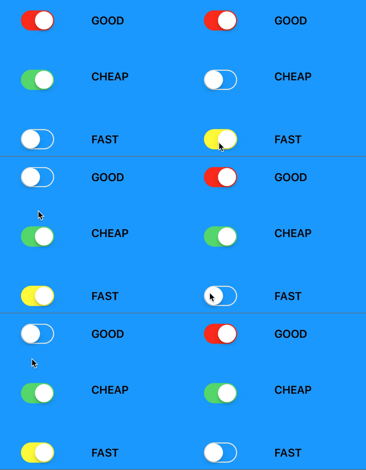
I hope you find this article helpful, here ‘s a fun gif made with EasyClosure APIs:

func allOn() -> Bool {
  return [good, cheap, fast].filter({ $0.isOn }).count == 3
}

good.on.valueChange { _ in
  if allOn() {
    fast.setOn(false, animated: true)
  }
}

cheap.on.valueChange { _ in
  if allOn() {
    good.setOn(false, animated: true)
  }
}

fast.on.valueChange { _ in
  if allOn() {
    cheap.setOn(false, animated: true)
  }
}

Read more

How to make Auto Layout more convenient in iOS

Issue #742

Auto Layout has been around since macOS 10.7 and iOS 6.0 as a nicer way to do layouts over the old resizing masks. Besides some rare cases when we need to manually specify origins and sizes, Auto Layout is the preferred way to do declarative layouts whether we choose to do UI in code or Storyboard. The Auto Layout APIs have some improvements over the years, there are also some sugar libraries that add easy syntaxes, so more choices for developers.

In this article, let’s take a review of how layout has improved over the years, from manual layout, autoresizing masks and finally to Auto Layout. I will mention a few takes on some libraries and how to abstract Auto Layout using the builder pattern. There are also some notes about the view life cycle and APIs improvements that might be overlooked. These are of course based on my experience and varies because of personal tastes but I hope you‘ll find something useful.

Although the article mention iOS, the same learning applies to watchOS, tvOS and macOS too.

Positioning a view before Auto Layout

When I first started iOS programming in early 2014, I read a book about Auto Layout and that book detailed lots of scenarios that completely confused me. It didn’t take long until I tried Auto Layout in an app and I realized it w as so simple. In its simplest sense, a view needs a position and a size to be correctly shown on the screen, everything else is just extra. In Auto Layout’s term, we need to specify enough constraints to position and size the view.

Manual layout using CGRect

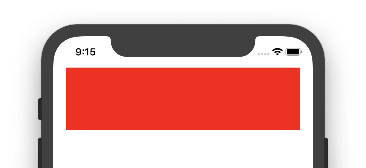
If we take a look back at the way we do a manual layout with the frame, there are origins and sizes. For example, here is how to position a red box that stretches accordingly with the width of the view controller.

1
2
3
4
5
6
7
8
9
10
11
12
13
14
15
16
class ViewController: UIViewController {

let box = UIView()
override func viewDidLoad() {
super.viewDidLoad()

box.backgroundColor = UIColor.red
view.addSubview(box)
}

override func viewDidLayoutSubviews() {
super.viewDidLayoutSubviews()

box.frame = CGRect(x: 20, y: 50, width: view.frame.size.width - 40, height: 100)
}
}

viewDidLoad is called when the view property of view controller is loaded, we need to wait until viewDidLayoutSubviews so that we have access to the final bounds. When the bounds change for a view controller’s view, the view adjusts the positions of its subviews and then the system calls this method.

Why is view size correct in viewDidLoad

viewDidLoad is definitely not the recommended way to do manual layout but there are times we still see that its view is correctly sized and fills the screen. This is when we need to read View Management in UIViewController more thoroughly:

Each view controller manages a view hierarchy, the root view of which is stored in the *view*property of this class. The root view acts primarily as a container for the rest of the view hierarchy. The size and position of the root view is determined by the object that owns it, which is either a parent view controller or the app’s window. The view controller that is owned by the window is the app’s root view controller and its view is sized to fill the window.
A view controller’s root view is always sized to fit its assigned space.

It can also be that the view has fixed size in xib or storyboard but we should control the size explicitly and do that in the right view controller method to avoid unexpected behaviors.

Autoresizing masks

Autoresizing mask was the old way to make layout a bit more declarative, also called springs and struts layout system. It is integer bit mask that determines how the receiver resizes itself when its superview’s bounds change. Combining these constants lets you specify which dimensions of the view should grow or shrink relative to the superview. The default value of this property is none, which indicates that the view should not be resized at all.

While we can specify which edges we want to fix and which should be flexible, it is confusing in the ways we do in xib and in code.

In the above screenshot, we pin the top of the red box to the top of the screen, and that is fixed distance. When the view changes size, the width and height of the red box changes proportionally, but the top spacing remains fixed.

In code, instead of specifying autoresizing in terms of fixed distance, we use flexible terms to specify which edges should be flexible.

To achieve the same red box on the top of the screen, we need to specify a flexible width and a flexible bottom margin. This means the left, right and top edges are fixed.

box.autoresizingMask = [.flexibleWidth, .flexibleBottomMargin]

Here are a few more scenarios

  • Horizontally fixed distance from the left: [.flexibleRightMargin]

  • Center horizontally [.flexibleLeftMargin, .flexibleRightMargin]

  • Vertically fixed distance from the top: [.flexibleBottomMargin]

  • Center vertically [.flexibleTopMargin, .flexibleBottomMargin]

These are not very intuitive and the way these are scaled proportionally may not fit our expectation. Also, note that multiple options can be done on the same axis.

When more than one option along the same axis is set, the default behavior is to distribute the size difference proportionally among the flexible portions. The larger the flexible portion, relative to the other flexible portions, the more it is likely to grow. For example, suppose this property includes the flexibleWidth and flexibleRightMarginconstants but does not include the flexibleLeftMargin constant, thus indicating that the width of the view’s left margin is fixed but that the view’s width and right margin may change.

Understanding of autoresizing masks won’t waste your time, we will come back to it in a few minutes 😉

Auto Layout to the rescue

Auto Layout, together with dynamic text and size classes, are recommended ways to build adaptive user interfaces as there the number of iOS devices with different screen sizes grows.

A constraint-based layout system

Auto Layout is described via NSLayoutConstraint by defining constraints between 2 objects. Here is the simple formula to remember:

item1.attribute1 = multiplier × item2.attribute2 + constant

Here is how to replicate that red box with NSLayoutConstraint. We need to specify which property of which view should be connected to another property of another view. Auto Layout supports many attributes such ascenterX, centerY and topMargin.

1
2
3
4
5
let marginTop = NSLayoutConstraint(item: box, attribute: .top, relatedBy: .equal, toItem: view, attribute: .top, multiplier: 1.0, constant: 50)
let marginLeft = NSLayoutConstraint(item: box, attribute: .left, relatedBy: .equal, toItem: view, attribute: .left, multiplier: 1.0, constant: 20)
let marginRight = NSLayoutConstraint(item: box, attribute: .right, relatedBy: .equal, toItem: view, attribute: .right, multiplier: 1.0, constant: -20)
let height = NSLayoutConstraint(item: box, attribute: .height, relatedBy: .equal, toItem: nil, attribute: .notAnAttribute, multiplier: 1.0, constant: 100)
NSLayoutConstraint.activate([marginTop, marginLeft, marginRight, height])

translatesAutoresizingMaskIntoConstraints

If we run the above code, we will get into the popular warning message regarding translatesAutoresizingMaskIntoConstraints

[LayoutConstraints] Unable to simultaneously satisfy constraints.
 Probably at least one of the constraints in the following list is one you don't want. 
 Try this: 
  (1) look at each constraint and try to figure out which you don't expect; 
  (2) find the code that added the unwanted constraint or constraints and fix it. 
 (Note: If you're seeing NSAutoresizingMaskLayoutConstraints that you don't understand, refer to the documentation for the UIView property translatesAutoresizingMaskIntoConstraints) 
(
    "<NSAutoresizingMaskLayoutConstraint:0x600003ef2300 h=--& v=--& UIView:0x7fb66c5059f0.midX == 0   (active)>",
    "<NSLayoutConstraint:0x600003e94b90 H:|-(20)-[UIView:0x7fb66c5059f0](LTR)   (active, names: '|':UIView:0x7fb66c50bce0 )>"
)

If you need some help deciphering this, there is wtfautolayout that does a good job on explaining what’s really happening.

It is said that resizing masks has been reimplemented using Auto Layout under the hood, and there is always NSAutoresizingMaskLayoutConstraint added to the view, hence the midX constraint.

We should never mix resizing masks and Auto Layout to avoid unwanted behavior, the fix is simply to disable translatesAutoresizingMaskIntoConstraints

box.translatesAutoresizingMaskIntoConstraints = false

This property is false by default for views from xib or storyboard but holds true if we declare layout in code. The intention is for the system to create a set of constraints that duplicate the behavior specified by the view’s autoresizing mask. This also lets you modify the view’s size and location using the view’s frame, bounds, or center properties, allowing you to create a static, frame-based layout within Auto Layout.

Visual Format Language

The Visual Format Language lets you use ASCII-art like strings to define your constraints. I see it is used in some code bases so it’s good to know it.

Here is how to recreate the red box using VFL. We need to specify constraints for both horizontal and vertical direction. Note that the same format string may result in multiple constraints:

1
2
3
4
5
6
let views = ["box" : box]
let horizontal = "H:|-20-[box]-20-|"
let vertical = "V:|-50-[box(100)]"
let horizontalConstraints = NSLayoutConstraint.constraints(withVisualFormat: horioptions: [], metrics: nil, views: views)
let verticalConstraints = NSLayoutConstraint.constraints(withVisualFormat: veoptions: [], metrics: nil, views: views)
NSLayoutConstraint.activate([horizontalConstraints, verticalConstraints].flatMap({ $0 }))

Visual Format Language is a bit nicer than the verbose NSLayoutConstraint initializer, but it encourages string format, which is error-prone.

addConstraint and activate

This may seem trivial but I see in modern code bases, there is still usage of addConstraint . This was old and hard to use, as we must find the nearest common ancestor view of the 2 views that envolve in Auto Layout.

Starting from iOS 8, there is isActive and the static activate functions that ease this adding constraints process a lot. Basically what it does is to activate or deactivate the constraint with calls toaddConstraint(_:) and removeConstraint(_:) on the view that is the closest common ancestor of the items managed by this constraint.

NSLayoutAnchor

Starting with macOS 10.11 and iOS 9, there was NSLayoutAnchor that simplifies Auto Layout a lot. Auto Layout was declarative, but a bit verbose, now it is simpler than ever with an anchoring system.

Here is how to achieve that same red box

NSLayoutConstraint.activate([
    box.topAnchor.constraint(equalTo: view.topAnchor, constant: 50),
    box.leftAnchor.constraint(equalTo: view.leftAnchor, constant: 20),
    box.rightAnchor.constraint(equalTo: view.rightAnchor, constant: -20),
    box.heightAnchor.constraint(equalToConstant: 100)
])

The cool thing about NSLayoutAnchor is its generic constrained API design. Constraints are divided into X-axis, Y-axis and dimension anchor type that makes it hard to make mistakes.

open class NSLayoutXAxisAnchor : NSLayoutAnchor<NSLayoutXAxisAnchor>
open class NSLayoutDimension : NSLayoutAnchor<NSLayoutDimension>

For example, we can’t pin the top anchor to the left anchor as they are in different axis, and it makes no sense. Attempt to do the following results in compilation issue as Swift strong type system ensures correctness.

box.topAnchor.constraint(equalTo: view.leftAnchor, constant: 50),

Ambiguous error message with NSLayoutAnchor

I’ve gone into a few cases where the error messages from NSLayoutAnchor don’t help. If we mistakenly connect topAnchor with centerXAnchor, which are not possible as they are from different axes.

NSLayoutConstraint.activate([
    box.topAnchor.constraint(equalTo: view.centerXAnchor, constant: 50)
])

Xcode complains of unwrapped UIView problem which may confuse us even more.

Value of optional type 'UIView?' must be unwrapped to refer to member 'centerXAnchor' of wrapped base type 'UIView'

Another puzzle, regarding this code

NSLayoutConstraint.activate([
    imageView.centerYAnchor.constraint(equalTo: view.centerYAnchor),
    imageView.leftAnchor.constraint(equalTo: view.leftAnchor, constant: 8),
    imageView.heightAnchor.constraint(equalToConstant: view.heightAnchor, mult0.7),
    imageView.widthAnchor.constraint(equalTo: imageView.heightAnchor, multiplier: 1.0)
])

Xcode is complaining about ‘Int’ is not convertible to ‘CGFloat’ which is very misleading. Can you spot the error?

The problem is that we are using equalToConstant , not equalTo . The generic constraints of NSLayoutAnchor is giving us misleading errors and can waste lots of time of us trying to figure out the subtle typos.

Abstractions over Auto Layout

NSLayoutAnchor is getting more popular now but it is not without any flaws. Depending on personal taste, there might be some other forms of abstractions over Auto Layout, namely Cartography and SnapKit, which I ‘ve used and loved. Here are a few of my takes on those.

Cartography

Cartography is one of the most popular ways to do Auto Layout in iOS. It uses operators which makes constraints very clear:

constrain(button1, button2) { button1, button2 in
    button1.right == button2.left - 12
}

What I don’t like about Cartography is that we have to repeat parameter names and that the parameters inside closure are just proxies, not real views and there is a limit on the number of constrain items.

Another huge con was that long compilation time issue due to excessive use of operators Very long compile time in large functions. Although Swift compilation time is getting better, this was a big problem. I even had to write a script to remove Cartography to use simple NSLayoutAnchor, so take a look at AutoLayoutConverter, which converts Cartography code from

constrain(logoImnageView, view1, view2) { logoImageView, view1, view2 in
    logoImageView.with == 74
    view1.left == view2.left + 20
}

to simple NSLayoutAnchor

Constraint.on(
  logoImageView.widthAnchor.constraint(equalToConstant: 74),
  view1.leftAnchor.constraint(equalTo: view2.leftAnchor, constant: 20),
)

There are always tradeoffs but to reduce compilation time at the time was a top priority.

SnapKit

SnapKit, originally Masonry, is perhaps the most popular Auto Layout wrapper

box.snp.makeConstraints { (make) -> Void in
   make.width.height.equalTo(50)
   make.center.equalTo(self.view)
}

The syntax is nice and with snp namespace to avoid extension name clashes, which I love.

The thing I don’t like about SnapKit is that limited closure. We can only work on 1 view at a time, and the make inside closure is just a proxy, which does not seem intuitive.

Imagine if we’re gonna make paging views or piano, where each view is stacked side by side. We need a lot of SnapKit calls as we can only work on 1 view at a time. Also, there is no clear relationship where we connect with the other view.

[https://github.com/onmyway133/blog/issues/22](https://github.com/onmyway133/blog/issues/22)https://github.com/onmyway133/blog/issues/22

keyB.snp.makeConstraints { (make) -> Void in
   make.left.equalTo(self.keyA.right)
}

keyC.snp.makeConstraints { (make) -> Void in
   make.left.equalTo(self.keyB.right)
}

keyD.snp.makeConstraints { (make) -> Void in
   make.left.equalTo(self.keyC.right)
}

The many overloading functions

There are also attempts to build simple Auto Layout wrapper functions but that escalates very quickly.

We might begin with an extension that pins edge constraints to superview.

box.pinEdgesToSuperview()

But a view does not always pin to its superview, it can be to another view, then we add another function

box.pinEdgesToView(_ view: UIView)

It would be nice if there is some padding, isn’t it? Let’s add insets options

box.pinEdgesToView(_ view: UIView, insets: UIEdgeInsets)

There might be cases where we only want to pin top, left, and right and not the bottom, let’s add another parameter

box.pinEdgesToView(_ view: UIView, insets: UIEdgeInsets, exclude: NSLayoutConstraint.Attribute)

Constraints are not always 1000 priorities, it can be lower. We need to support that

box.pinEdgesToView(_ view: UIView, insets: UIEdgeInsets, exclude: NSLayoutConstraint.Attribute, priority: NSLayoutConstraint.Priority)

We might exclude more than one properties or set different priority levels for each constraint. The simple wrapper with overloading functions and default parameters are just like building rigid abstraction based on premature assumptions. This just limits us in the long run and not scalable 😢

Embracing Auto Layout

All the Auto Layout frameworks out there are just convenient ways to build NSLayoutConstraint, in fact, these are what you normally need

  • Call addSubview so that view is in the hierarchy

  • Set translatesAutoresizingMaskIntoConstraints = false

  • Set isActive = true to enable constraints

Here is how to make an extension on NSLayoutConstraint that disables translatesAutoresizingMaskIntoConstraints for the involved views. Code is from Omnia

1
2
3
4
5
6
7
8
9
10
11
12
13
14
15
16
17
public extension NSLayoutConstraint {

/// Disable auto resizing mask and activate constraints
///
/// - Parameter constraints: constraints to activate
static func on(_ constraints: [NSLayoutConstraint]) {
constraints.forEach {
($0.firstItem as? UIView)?.translatesAutoresizingMaskIntoConstraints = false
$0.isActive = true
}
}

static func on(_ constraintsArray: [[NSLayoutConstraint]]) {
let constraints = constraintsArray.flatMap({ $0 })
NSLayoutConstraint.on(constraints)
}
}

Here before we activate constraints, we find the firstItem then disables translatesAutoresizingMaskIntoConstraints. From Swift 4.2 there is a separation between compactMap and flatMap so we can safely use flatMap to flatten an array of arrays. This is useful when we have an array of arrays of constraints.

1
2
3
4
5
6
7
8
9
10
11
12
13
14
15
public extension UIView {
func pinCenter(view: UIView) -> [NSLayoutConstraint] {
return [
centerXAnchor.constraint(equalTo: view.centerXAnchor),
centerYAnchor.constraint(equalTo: view.centerYAnchor)
]
}

func pin(size: CGSize) -> [NSLayoutConstraint] {
return [
widthAnchor.constraint(equalToConstant: size.width),
heightAnchor.constraint(equalToConstant: size.height)
]
}
}

With that, we can pin the red box with a certain size and to the center of the screen:

NSLayoutConstraint.on([
    box.pinCenter(view: view),
    box.pin(size: CGSize(width: 100, height: 50))
])

This is a very thin but powerful wrapper over NSLayoutAnchor and we can expand it the way we need. It sadly has some problems, like we can’t easily change the priority, as we have to reference the constraint 😢

let topConstraint = box.topAnchor.constraint(equalTo: view.topAnchor, constant: 50)
topConstraint.priority = UILayoutPriority.defaultLow

NSLayoutConstraint.on([
    topConstraint
])

Making Auto Layout more convenient with the builder pattern

The above extension on NSLayoutConstraint works well. However, if you’re like me who wants even more declarative and fast Auto Layout code, we can use the builder pattern to make Auto Layout even nicer. The builder pattern can be applied to many parts of the code but I find it very well suited for Auto Layout. The final code is Anchors on GitHub, and I will detail how to make it.

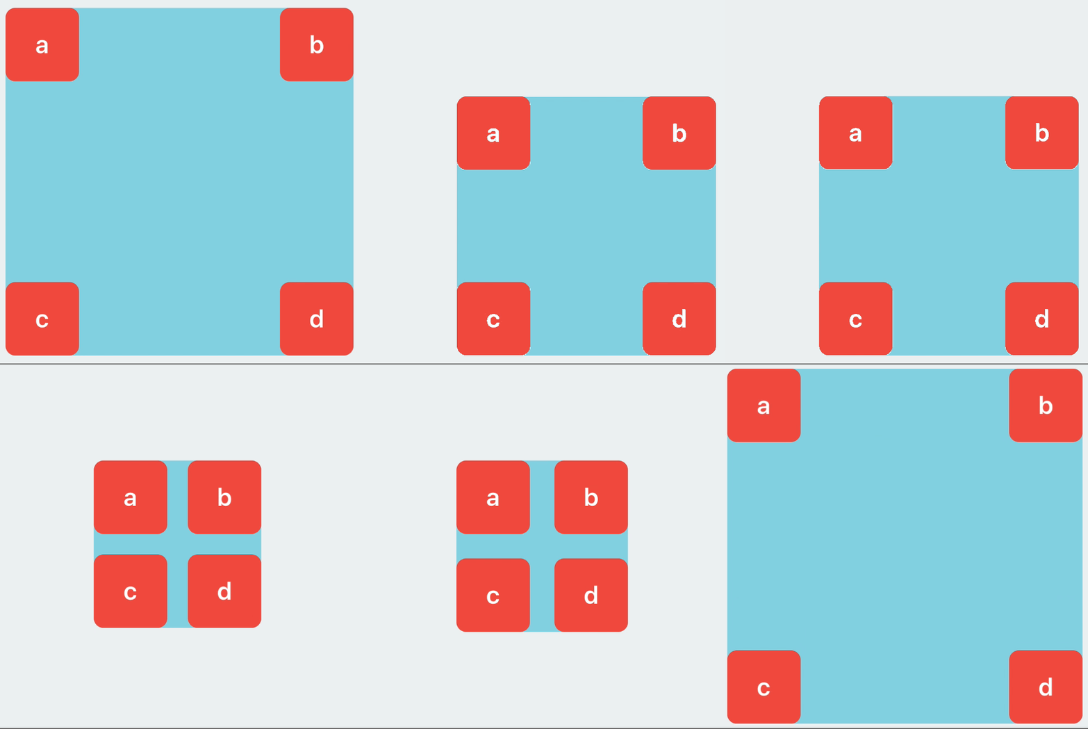
Here is what we want to achieve to quickly position 4 views:

activate(
  boxA.anchor.top.left,
  boxB.anchor.top.right,
  boxC.anchor.bottom.left,
  boxD.anchor.bottom.right
)

Most of the times, we want to anchor to parent view, so that should be implicitly done for us. I like to have anchor namespace to avoid extension naming clashes and to make it the starting point for all our convenient Auto Layout code. Let’s identify a few core concepts

Which objects can interact with Auto Layout?

Currently, there are 3 types of objects that can interact withAuto Layout

  • UIView

  • UILayoutSupport, from iOS 7, for UIViewController to get bottomLayoutGuide and topLayoutGuide . In iOS 11, we should use safeAreaLayoutGuide from UIView instead

  • UILayoutGuide: using invisible UIView to do Auto Layout is expensive, that’s why Apple introduced layout guides in iOS 9 to help.

So to support these 3 with anchor namespace, we can make Anchor object that holds AnyObject as behind the scene, NSLayoutConstraint works with AnyObject:

public class Anchor: ConstraintProducer {
  let item: AnyObject

/// Init with View
  convenience init(view: View) {
    self.init(item: view)
  }

/// Init with Layout Guide
  convenience init(layoutGuide: LayoutGuide) {
    self.init(item: layoutGuide)
  }

// Init with Item
  public init(item: AnyObject) {
    self.item = item
  }
}

Now we can define anchor property

public extension View {
  var anchor: Anchor {
    return Anchor(view: self)
  }
}

public extension LayoutGuide {
  var anchor: Anchor {
    return Anchor(layoutGuide: self)
  }
}

Which properties are needed in a layout constraint?

The builder patterns make building things declaratively by holding temporary values. Besides from, to, priority, identifier, we need an array of pins to handle cases where there are multiple created constraints. A center constraint results in both centerX and centerY constraints, and an edge constraint results in top, left, bottom and right constraints.

1
2
3
4
5
6
7
8
9
10
11
12
13
14
15
16
17
18
19
20
21
22
enum To {
case anchor(Anchor)
case size
case none
}
class Pin {
let attribute: Attribute
var constant: CGFloa
init(_ attribute: Attribute, constant: CGFloat = 0) {
self.attribute = attribute
self.constant = constant
}
let item: AnyObject
// key: attribute
// value: constant
var pins: [Pin] = [
var multiplierValue: CGFloat = 1
var priorityValue: Float?
var identifierValue: String?
var referenceBlock: (([NSLayoutConstraint]) -> Void)?
var relationValue: Relation = .equal
var toValue: To = .none

With this, we can also expand our convenient anchor to support more constraints, like spacing horizontally, which adds left and right constraints with correct constants. Because as you know, in Auto Layout, for right and bottom direction, we need to use negative values:

func paddingHorizontally(_ value: CGFloat) -> Anchor {
  removeIfAny(.leading)
  removeIfAny(.trailing
  pins.append(Pin(.leading, constant: value))
  pins.append(Pin(.trailing, constant: -value)
  return self
}

Inferring constraints

There are times we want to infer constraints, like if we want a view’s height to double its width. Since we already have width, declaring ratio should pair the height to the width.

box.anchor.width.constant(10)
box.anchor.height.ratio(2) // height==width*2

This is easily achieved by checking our pins array

if sourceAnchor.exists(.width) {
  return Anchor(item: sourceAnchor.item).width
    .equal
    .to(Anchor(item: sourceAnchor.item).height)
    .multiplier(ratio).constraints()
} else if sourceAnchor.exists(.height) {
  return Anchor(item: sourceAnchor.item).height
    .equal
    .to(Anchor(item: sourceAnchor.item).width)
    .multiplier(ratio).constraints()
} else {
  return []
}

Retrieving a constraint

I see we’re used to storing constraint property in order to change its constant later. The constraints property in UIView has enough info and it is the source of truth, so retrieving constraint from that is more preferable.

Here‘s how we find constraint and update that

boxA.anchor.find(.height)?.constant = 100

// later
boxB.anchor.find(.height)?.constant = 100

// later
boxC.anchor.find(.height)?.constant = 100

The code to find constraint is very straightforward.

1
2
3
4
5
6
7
8
9
10
11
12
13
14
15
16
17
18
19
20
21
public extension Anchor {
/// Find a constraint based on an attribute
func find(_ attribute: Attribute) -> NSLayoutConstraint? {
guard let view = item as? View else {
return nil
}
var constraints = view.superview?.constraints
if attribute == .width || attribute == .height {
constraints?.append(contentsOf: view.constraints)
}
return constraints?.filter({
guard $0.firstAttribute == attribute else {
return false
}
guard $0.firstItem as? NSObject == view else {
return false
}
return true
}).first
}
}

How to reset constraints

One of the patterns I see all over is resetting constraints in UITableViewCell or UICollectionViewCell. Depending on the state, the cell removes certain constraints and add new constraints. Cartography does this well by using group.

constrain(view, replace: group) { view in
    view.top  == view.superview!.top
    view.left == view.superview!.left
}

If we think about it, NSLayoutConstraint is just layout instructions. It can be activated or deactivated . So if we can group constraints, we can activate or deactivate them as a whole.

Here is how to declare 4 groups of constraints, the syntax is from Anchors but this applies to NSLayoutAnchor as well since those generateNSLayoutConstraint under the hood.

let g1 = group(box.anchor.top.left)
let g2 = group(box.anchor.top.right)
let g3 = group(box.anchor.bottom.right)
let g4 = group(box.anchor.bottom.left)

Where to go from here

In this article, we step a bit in time into manual layout, autoresizing masks and then to the modern Auto Layout. The Auto Layout APIs have improvements over the years and are recommended way to do layout. Learning declarative layout also helps me a lot when I learn Constraint Layout in Android, flexbox in React Native or the widget layout in Flutter.

The post goes through the detailed implementation of how we can build more convenient Auto Layout like Anchors with the builder pattern. In the next article, let’s explore the many ways to debug Auto Layout and how to correctly do Auto Layout for different screen sizes.

In the meantime, let’s play Tetris in Auto Layout, because why not 😉

[https://github.com/onmyway133/Anchors](https://github.com/onmyway133/Anchors)https://github.com/onmyway133/Anchors

activate(
  lineBlock.anchor.left.bottom
)

// later
activate(
  firstSquareBlock.anchor.left.equal.to(lineBlock.anchor.right),
  firstSquareBlock.anchor.bottom
)

// later
activate(
  secondSquareBlock.anchor.right.bottom
)

Read more


Updated at 2021-01-05 07:22:31

How to use flexible frame in SwiftUI

Issue #734

In SwiftUI there are fixed frame and flexible frame modifiers.

Fixed frame Positions this view within an invisible frame with the specified size.

Use this method to specify a fixed size for a view’s width, height, or both. If you only specify one of the dimensions, the resulting view assumes this view’s sizing behavior in the other dimension.

1
2
3
4
5
6
7
8
VStack {
Ellipse()
.fill(Color.purple)
.frame(width: 200, height: 100)
Ellipse()
.fill(Color.blue)
.frame(height: 100)
}

Flexible frame frame(minWidth:idealWidth:maxWidth:minHeight:idealHeight:maxHeight:alignment:)

Read the documentation carefully

Always specify at least one size characteristic when calling this method. Pass nil or leave out a characteristic to indicate that the frame should adopt this view’s sizing behavior, constrained by the other non-nil arguments.

The size proposed to this view is the size proposed to the frame, limited by any constraints specified, and with any ideal dimensions specified replacing any corresponding unspecified dimensions in the proposal.

If no minimum or maximum constraint is specified in a given dimension, the frame adopts the sizing behavior of its child in that dimension. If both constraints are specified in a dimension, the frame unconditionally adopts the size proposed for it, clamped to the constraints. Otherwise, the size of the frame in either dimension is:

If a minimum constraint is specified and the size proposed for the frame by the parent is less than the size of this view, the proposed size, clamped to that minimum.

If a maximum constraint is specified and the size proposed for the frame by the parent is greater than the size of this view, the proposed size, clamped to that maximum.

Otherwise, the size of this view.

Experiment with different proposed frame

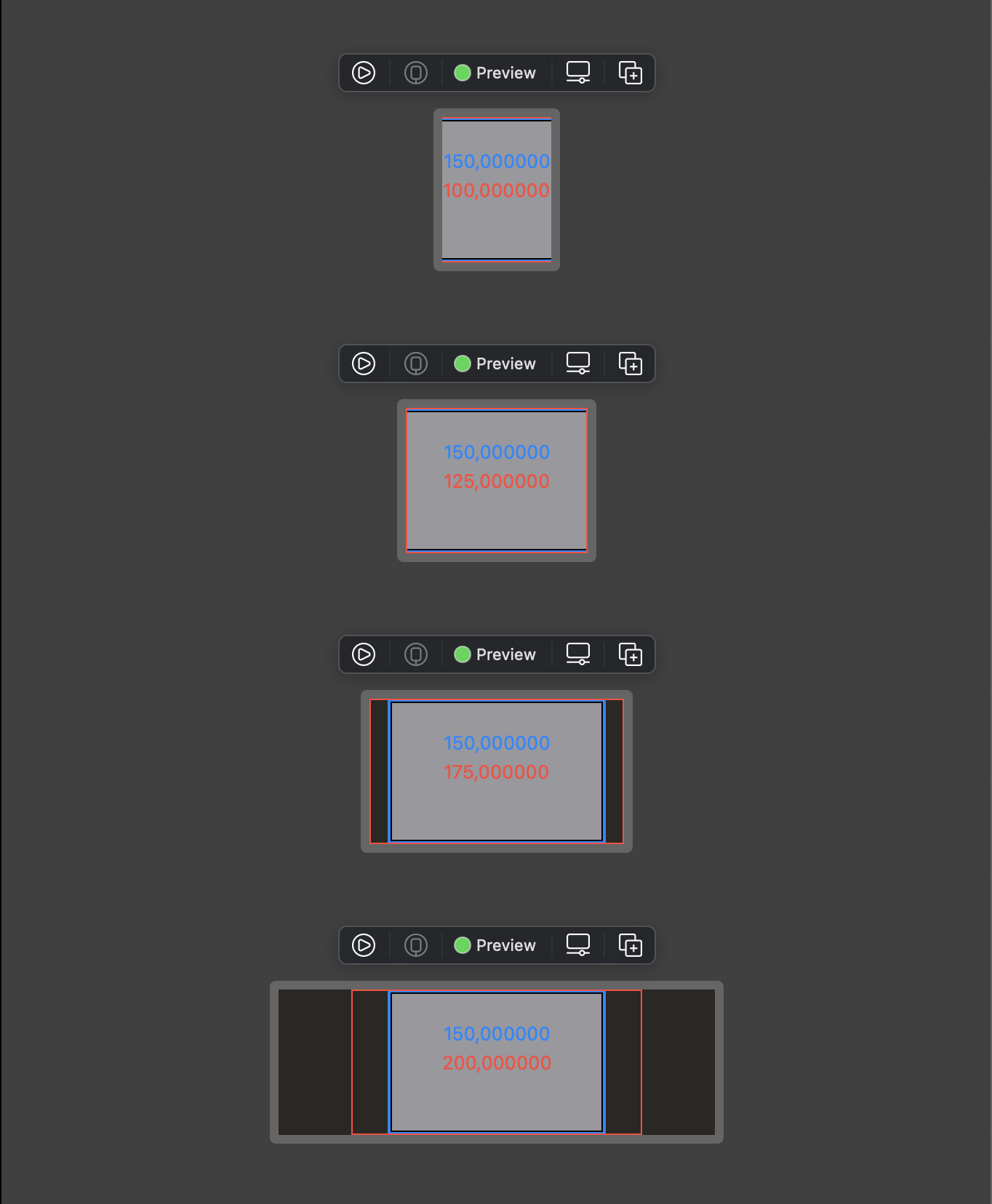
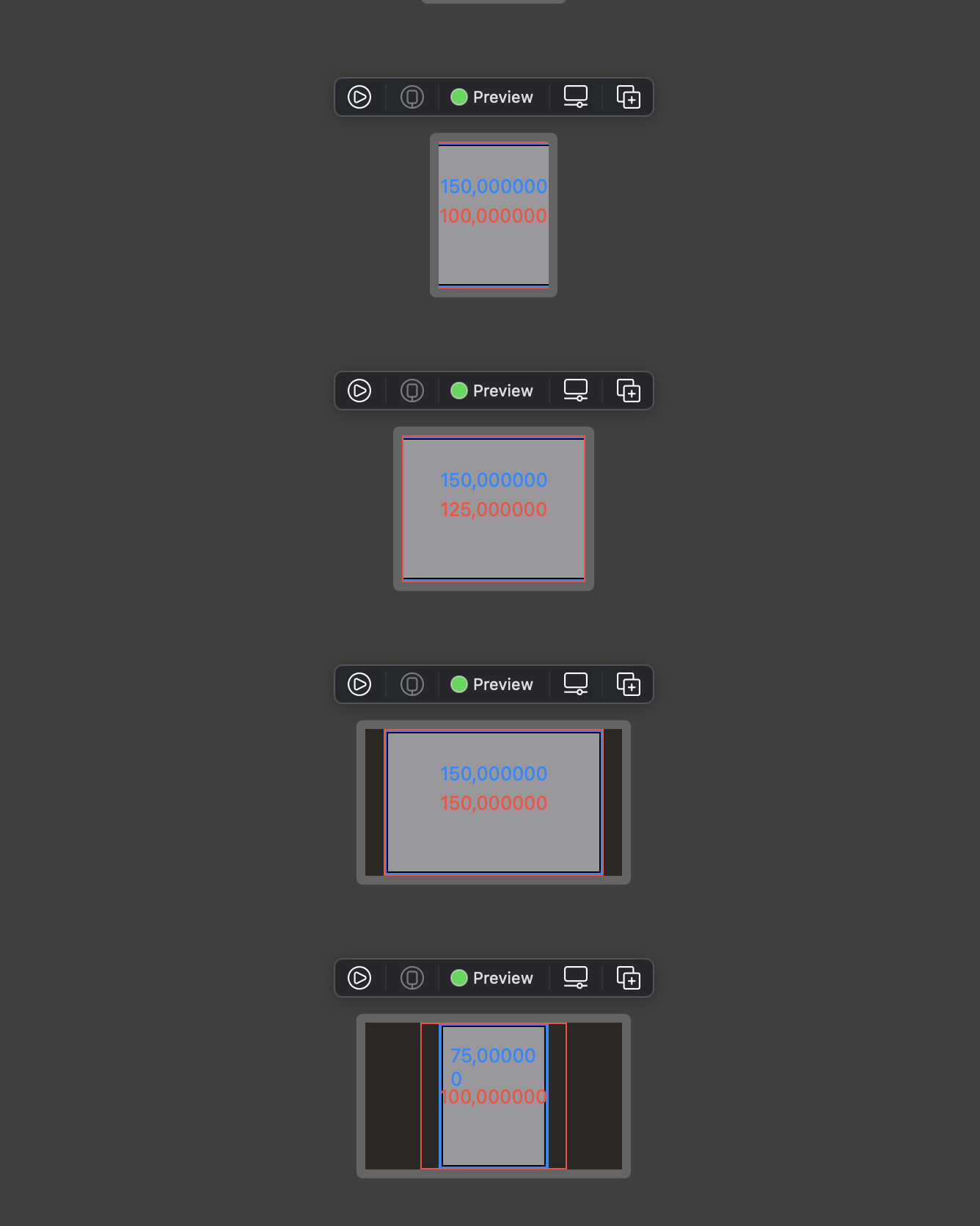
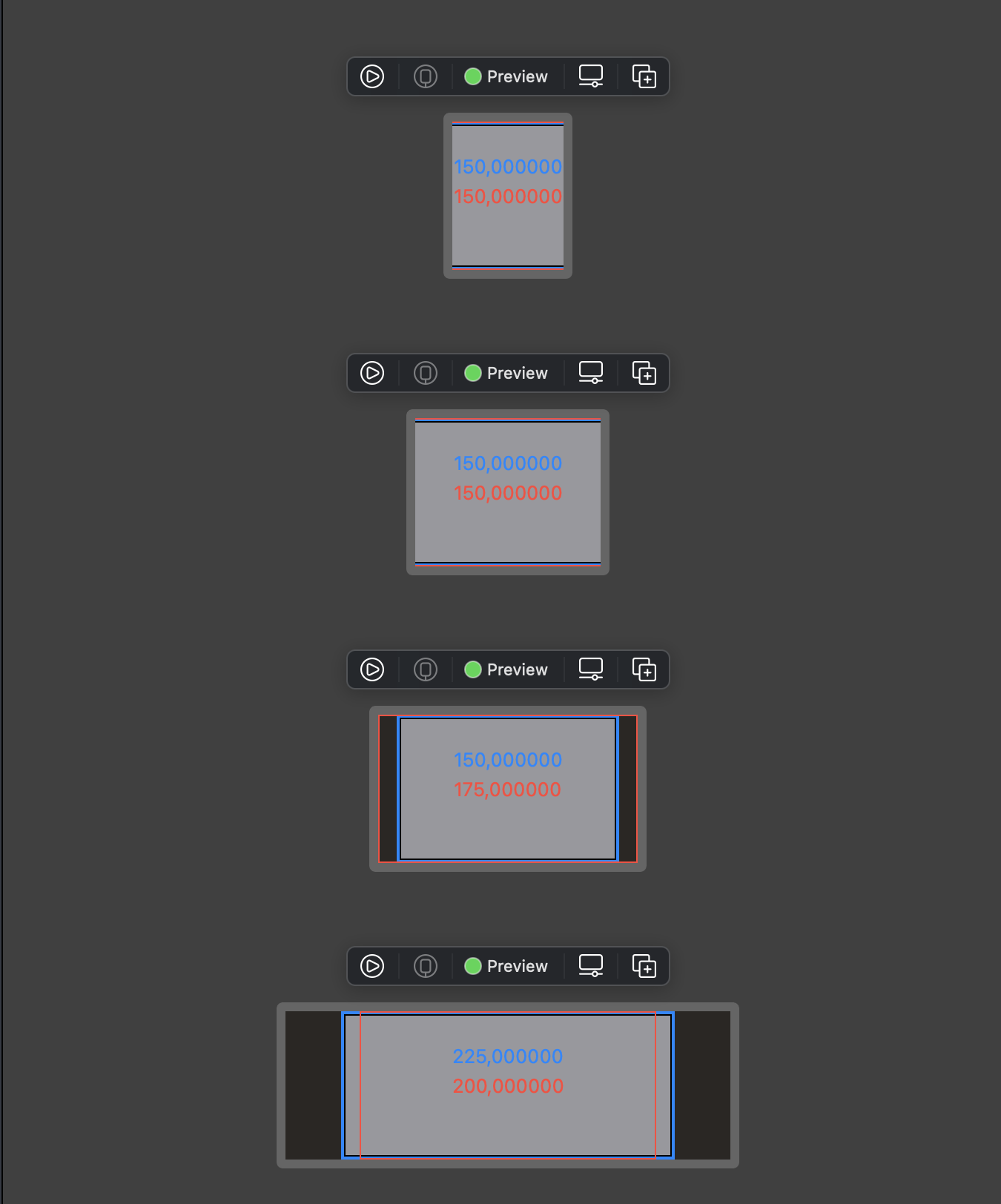
To understand the explanation above, I prepare a Swift playground to examine with 3 scenarios: when both minWidth and maxWidth are provided, when either minWidth or maxWidth is provided. I use width for horizontal dimension but the same applies in vertical direction with height.

I have a View called Examine to demonstrate flexible frame. Here we have a flexible frame with red border and red text showing its size where you can specify minWidth and maxWidth.

Inside it is the content with a fixed frame with blue border and blue text showing content size where you can specify contentWidth. Finally there’s parentWidth where we specify proposed width to our red flexible frame.

The variations for our scenarios are that proposed width falls outside and inside minWidth, contentWidth, and maxWidth range.

1
2
3
4
5
6
7
8
9
10
11
12
13
14
15
16
17
18
19
20
21
22
23
24
25
26
27
28
29
30
31
32
33
34
35
36
37
38
39
40
41
42
43
44
45
46
47
48
49
50
51
52
53
54
55
56
57
58
59
60
61
62
63
64
65
66
67
68
69
70
71
72
73
74
75
76
77
78
79
80
81
82
83
84
import SwiftUI

struct Examine: View {
let parentWidth: CGFloat
let contentWidth: CGFloat
var minWidth: CGFloat?
var maxWidth: CGFloat?

var body: some View {
Rectangle()
.fill(Color.gray)
.border(Color.black, width: 3)
.frame(width: contentWidth)
.overlay(
GeometryReader { geo in
Text("\(geo.size.width)")
.foregroundColor(Color.blue)
.offset(x: 0, y: -20)
.center()
}
)
.border(Color.blue, width: 2)
.frame(minWidth: minWidth, maxWidth: maxWidth)
.overlay(
GeometryReader { geo in
Text("\(geo.size.width)")
.foregroundColor(Color.red)
.center()
}
)
.border(Color.red, width: 1)
.frame(width: parentWidth, height: 100)
}
}

extension View {
func center() -> some View {
VStack {
Spacer()
HStack {
Spacer()
self
Spacer()
}
Spacer()
}
}
}

struct Examine_Previews: PreviewProvider {
static var previews: some View {
Group {
Group {
Text("Both minWidth and maxWidth")
Examine(parentWidth: 75, contentWidth: 150, minWidth: 100, maxWidth: 200)
.help("proposed size < min width")
Examine(parentWidth: 125, contentWidth: 150, minWidth: 100, maxWidth: 200)
.help("min width < proposed size < content")
Examine(parentWidth: 175, contentWidth: 150, minWidth: 100, maxWidth: 200)
.help("min width < content < proposed size")
Examine(parentWidth: 300, contentWidth: 150, minWidth: 100, maxWidth: 200)
.help("min width < content < max width < proposed size")
}

Group {
Text("Just minWidth")
Examine(parentWidth: 75, contentWidth: 150, minWidth: 100)
Examine(parentWidth: 125, contentWidth: 150, minWidth: 100)
Examine(parentWidth: 175, contentWidth: 150, minWidth: 100)
Examine(parentWidth: 175, contentWidth: 75, minWidth: 100)
.help("content < minWidth")
}

Group {
Text("Just maxWidth")
Examine(parentWidth: 75, contentWidth: 150, maxWidth: 200)
Examine(parentWidth: 125, contentWidth: 150, maxWidth: 200)
Examine(parentWidth: 175, contentWidth: 150, maxWidth: 200)
Examine(parentWidth: 300, contentWidth: 225, maxWidth: 200)
.help("content > maxWidth")
}
}
}
}

Observation

Here are the results with different variations of specifying parentWidth aka proposed width.

🍑 Scenario 1: both minWidth and maxWidth are specified

Our red flexible frame clamps proposed width between its minWidth and maxWidth, ignoring contentWidth

1
let redWidth = clamp(minWidth, parentWidth, maxWidth)
Screenshot 2021-01-01 at 23 30 19

🍅 Scenario 2: only minWidth is specified

Our red flexible frame clamps proposed width between its minWidth and contentWidth. In case content is less than minWidth, then final width is minWidth

1
let redWidth = clamp(minWidth, parentWidth, contentWidth)
Screenshot 2021-01-01 at 23 51 46

🍏 Scenario 3: only maxWidth is specified

Our red flexible frame clamps proposed width between its contentWidth and maxWidth. In case content is more than maxWidth, then final width is maxWidth

1
let redWidth = clamp(contentWidth, parentWidth, maxWidth)
Screenshot 2021-01-01 at 23 52 27

What are idealWidth and idealHeight

In SwiftUI, view takes proposed frame from its parent, then proposes its to its child, and reports the size it wants from it’s child and its proposed frame from parent. The reported frame is the final frame used by that view.

When we use .frame modifier, SwiftUI does not changes the frame of that view directly. Instead it creates a container around that view.

There are 4 kinds of frame behavior depending on which View we are using. Some have mixed behavior.

  • Sum up frames from its children then report the final frame. For example HStack, VStack
  • Merely use the proposed frame. For example GeometryReader, .overlay, Rectangle
  • Use more space than proposed. For example texts with fixedSize
  • Use only space needed for its content and respect proposed frame as max

Fix the size to its ideal size

Some View like Text or Image has intrinsic content size, means it has implicit idealWidth and idealHeight. Some like Rectangle we need to explicit set .frame(idealWidth: idealHeight). And these ideal width and height are only applied if we specify fixedSize

To understand this, let’s read fixedSize

Fixes this view at its ideal size.
During the layout of the view hierarchy, each view proposes a size to each child view it contains. If the child view doesn’t need a fixed size it can accept and conform to the size offered by the parent.
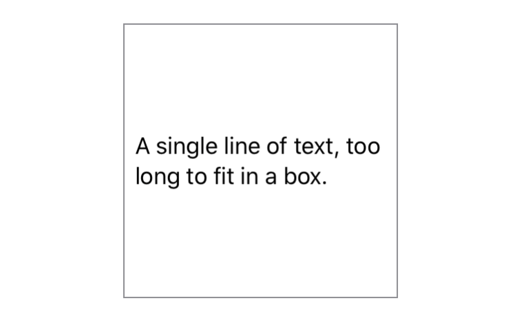
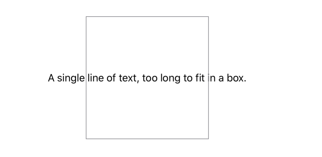
For example, a Text view placed in an explicitly sized frame wraps and truncates its string to remain within its parent’s bounds:

1
2
3
Text("A single line of text, too long to fit in a box.")
.frame(width: 200, height: 200)
.border(Color.gray)
Screenshot 2021-01-02 at 00 15 14

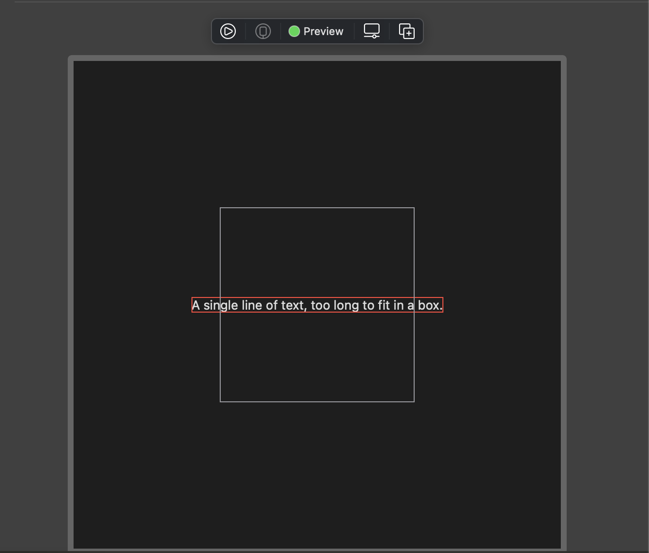
The fixedSize() modifier can be used to create a view that maintains the ideal size of its children both dimensions:

1
2
3
4
Text("A single line of text, too long to fit in a box.")
.fixedSize()
.frame(width: 200, height: 200)
.border(Color.gray)
Screenshot 2021-01-02 at 00 16 11

You can think of fixedSize() as the creation of a counter proposal to the view size proposed to a view by its parent. The ideal size of a view, and the specific effects of fixedSize() depends on the particular view and how you have configured it.

To view this in playground, I have prepared this snippet

1
2
3
4
5
6
7
8
9
10
11
12
13
14
struct Text_Previews: PreviewProvider {
static var previews: some View {
VStack(spacing: 16) {
Text("A single line of text, too long to fit in a box.")
.fixedSize()
.border(Color.red)
.frame(width: 200, height: 200)
.border(Color.gray)
}
.padding()
.frame(width: 500, height: 500)

}
}

Here we can see that our canvas is 500x500, and the Text grows outside its parent frame 200x200

Screenshot 2021-01-02 at 00 17 29

Play with Rectangle

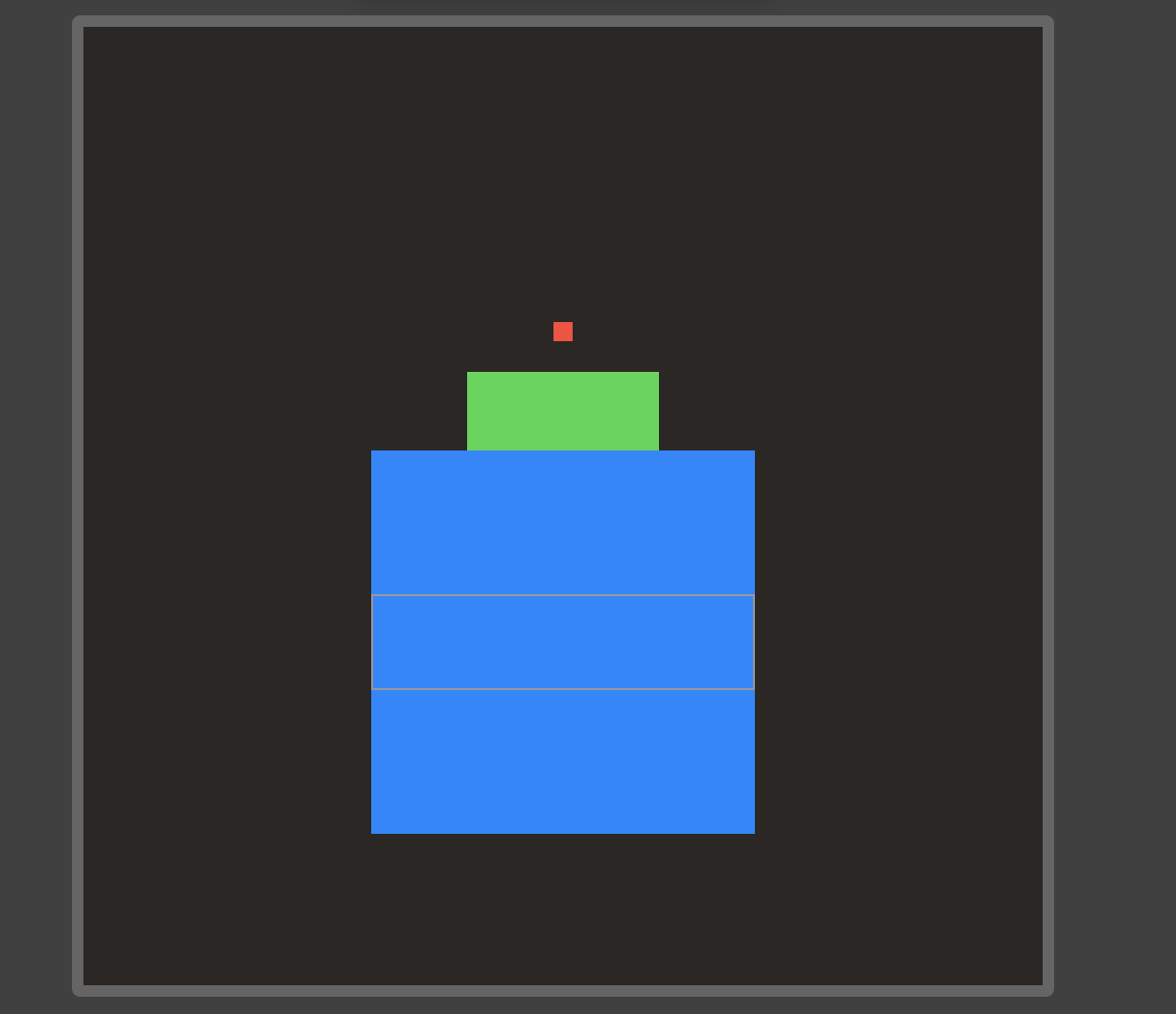
Remember that shapes like Rectangle takes up all the proposed size. When we explicitly specify fixedSize, theidealWidth and idealHeight are used.

Here I have 3 rectangle

🍎 Red: There are no ideal size explicitly specified, so SwiftUI uses a magic number 10 as the size
🍏 Green: We specify frame directly and no idealWidth, idealHeight and no fixedSize, so this rectangle takes up full frame
🧊 Blue: The outer gray box has height 50, but this rectangle uses idealWidth and idealHeight of 200 because we specify fixedSize

1
2
3
4
5
6
7
8
9
10
11
12
13
14
15
16
17
18
19
20
21
22
23
struct ContentView_Previews: PreviewProvider {
static var previews: some View {
VStack(spacing: 16) {
Rectangle()
.fill(Color.red)
.fixedSize()

Rectangle()
.fill(Color.green)
.frame(width: 100, height: 100)

Rectangle()
.fill(Color.blue)
.frame(idealWidth: 200, idealHeight: 200)
.fixedSize(horizontal: true, vertical: true)
.frame(height: 50)
.border(Color.gray)
}
.padding()
.frame(width: 500, height: 500)

}
}
Screenshot 2021-01-02 at 00 23 29

Updated at 2021-01-01 23:25:08

My year in review 2020

Issue #715

I remember this time last year in December 2019, I spent almost every single bit of my free time on Puma because I want a Swift friendly version of fastlane that suits my need and leverages Swift 5 features.

Here’s my review of my work in year 2020.

Blogging

I started blogging on GitHub issue, starting from Issue 1 Hello world, again, now I have over 670 issues, which were generated into blog posts at my website https://onmyway133.com/

🍏 I used to use onmyway133.github.io domain, but then it feels right to have my own domain
🍎 I used to write a lot at Medium https://medium.com/@onmyway133 for many publications and my own Fantageek publication, I have got 2.3k followers with around 60k views per month
🍓 I list my most favorite articles, usually articles that I spent most time polishing here https://onmyway133.com/writing/

One of my very first articles published on Flawless iOS publication was A better way to update UICollectionView data in Swift with diff framework gets the highest traffic ever, and was rated most trending Swift article for 2018.

My one of few articles published in Medium in 2019 was How to make Auto Layout more convenient in iOS got featured in iOS Dev Weekly, and used to promote my library EasyAnchor

My big article this year is How to test push notifications in simulator and production iOS apps, which was also featured on iOS Dev Weekly, used to summary the changes in push notifications from iOS 7 to iOS 14, and to promote my push notification testing tool Push Hero

My blog at https://onmyway133.com/ has around 15k views each month. I can write proper, lengthy articles to get more views but I don’t want to. I want to write blog about solutions I have found, so that my future self can benefit from it without searching too much.

views

Open source

I have done quite a lot of open source, you can view here Open source. These have helped tons of apps, with 45k+ apps touched, and 3.4m+ downloads as stats on CocoaPods

My 4 libraries this year get inspired by SwiftUI and property wrappers

🍌 Spek leverages property wrapper to provide Spec syntax, similar to Quick, but simpler and can generate tests
🍈 Micro imitates SwiftUI State and ForEach syntax but use UICollectionView with diffable datasource, powered by my another library DeepDiff
🍑 EasySwiftUI contains many extensions and useful modifier that I use in my SwiftUI apps
🥝 FontAwesomeSwiftUI I was tired of using bitmap with dark and light variants, and I can’t use SFSymbols as I want to support macOS 10.15, so FontAwesome is a perfect choice. I couldn’t find library that has support for SwiftUI and easy to use with Swift Package Manager for iOS and macOS, so I made one

Besides, for all my libraries EasyStash, EasyAnchor, EasyTheme, EasyClosure, … I have now support Swift Package Manager, which is nicer to integrate. Thank you CocoaPods for all these years.

There are now 1.6k people following me on GitHub, that means a lot, meaning somehow my work is useful

Lately, I open source awesome-swiftui which I curate all SwiftUI resources, articles and libraries that I find useful for my apps

❤️ One day, I got sponsor from my dear friend Chris for my GitHub open source. Chris is my open source idol who ignited my desire for open source. No one loves open source more than Chris

Apps

I started making some apps late last year, first I published them on Gumroad, but it didn’t feel right, and then I published all my apps on AppStore. I like sandboxed apps from AppStore because they limit what the apps can do.

Apps without Twitter account and landing page seem off, so in May I started revamping my websites, and I wrote my apps page firstly with pure HTML and CSS, then I rewrote in React, because I like React and Javascript.

Notably, early 2020 I made Push Hero, PastePal then I made a complete overhaul lately with more features, thanks to all the feedback. I also took the time to revamp landing pages a lot, you can check landing pages for Push Hero for example because I have a white label solution

Learn how I did white label landing page using React

I have a lot of ideas, but very little time.

Learning

Coding can be done, but design is never finished. When making apps, I feel like I’m not certain at some design decisions and no matter how I landed with some designs, I didn’t feel happy. Then I took some design courses and books.

Below is my tweet that I share some design resources that I found useful

Listening

I used to listen to tech podcasts, then I was bored. Discussions like whether to use MVVM vs MVC, SwiftUI vs Catalyst, Swift vs Objective don’t interest me anymore.

If you ask me for choices, my default answer will be NO. Those who are super passionate about their idea will just ignore my advice and do it anyway.

Then I listen to indie and product development podcasts, it was inspiring. Once I got the mindset, they also became boring.
Now I listen to mostly books on Storytel, some books about habit and making time really make my days.

Tweet

I came back to Twitter early this year after quitting it for a while because I got enough of all negative and nonsense political debates. But then I found that I can decide who I can follow and what content I want to view. Then I started organizing List, making my own Chrome extensions to automate things and control what I want to view. I have followed quite many indie developers and great product people, I’ve learnt a lot. The downside is I’m overwhelmingly inspired, I can’t sleep.

I try to tweet more about what I’ve learned, sharing articles that I have written. For example here I share about how to gain product idea

WWDC Together

Notable this year is the website I make WWDC Together as a place for developers like us to hangout and watch videos together. Each video acts like its own chat room, you can also create private chatroom. My colleagues use this and we watched WWDC together with coke and pizza, it was a lot of fun.

I had the idea like 2 weeks before WWDC, so I had to make it quick. Working with React is fun to me, it is like playing video game.

I was lucky to be asked by John to write a guest post Behind the scenes of WWDC Together with Khoa Pham on his website.

It was also mentioned by Paul in his WWDC wrap up WWDC20: Wrap up and recommended talks

One area that absolutely flourished this year was community organization. Sites like https://wwdcwatch.party and https://wwdctogether.com took a huge amount of work to organize, but meant that people had the chance to have some interaction – had the chance to actually chat about WWDC and share their excitement. I’m really grateful to Michie, Khoa, and other community organizers for making this happen.

I also got to share about in in a well known Norwegian tech website orske WWDC Together lar oss se på Apples konferanse sammen

Speaking

In 2019, I made several meetup talks, and one pre conf talk for Mobile Era conf

In 2020, I’m lucky to be invited to talk in some events

🍅 WWDC Watch Party

I’m happy to be invited by Michie to talk along side with John and Łukasz, whom I really admire for their awesome open source contribution, to talk about how to start and contribute to open source

🥦 Bitrise webminar

I shared my thoughts about my favorites at WWDC and the future ahead

🍇 Contributing.today

During Hacktoberfest 2020, I was contacted by my friend Maxim to share about open source

Work

I’m happy to continue another awesome year at Shortcut and DNB, where I have awesome and super nice colleagues. I ‘ve made lots of friends who I can talk with, who invited me to play badminton, tennis, football, swimming, hiking. Why didn’t we meet earlier?

I was lucky to attend a workshop hosted by John Sundell at work, I learned a lot

Life

Thanks for a memorable year, despite all the lockdown. And remember, balance work and life. You don’t need to be super rich to be happy. Having lots of money in the bank while living alone is not fun at all.

Another year is coming to an end. When looking back, do you miss the time you didn’t spend with your friends and family, or do you miss the time you didn’t get to do your work?

May your code continue to compile 🙏

Updated at 2021-01-01 23:25:50

How to do didSet for State and Binding in SwiftUI

Issue #714

Below is an example of a parent ContentView with State and a child Sidebar with a Binding.

The didSet is only called for the property that is changed.

When we click Button in ContentView, that changes State property, so only the didSet in ContentView is called
When we click Button in Sidebar, that changes Binding property, so only the didSet in Sidebar is called

1
2
3
4
5
6
7
8
9
10
11
12
13
14
15
16
17
18
19
20
21
22
23
24
25
26
27
28
29
30
31
32
33
34
35
36
enum Tag: String {
case all
case settings
}

struct ContentView: View {
@State
private var tag: Tag = .all {
didSet {
print("ContentView \(tag)")
}
}

var body: some View {
Sidebar(tag: $tag)
Button(action: { tag = .settings }) {
Text("Button in ContentView")
}
}
}

struct Sidebar: View {
@Binding
var tag: Tag {
didSet {
print("Sidebar \(tag)")
}
}

var body: some View {
Text(tag.rawValue)
Button(action: { tag = .settings }) {
Text("Button in Sidebar")
}
}
}

Custom Binding with get set

Another way to observe Binding changes is to use custom Binding with get, set. Here even if we click Button in ContentView, the set block is triggered and here we can change State

1
2
3
4
5
6
7
8
9
10
11
12
var body: some View {
Sidebar(tag: Binding<Tag>(
get: { tag },
set: { newTag in
self.tag = newTag
print("ContentView newTag \(newTag)")
}
))
Button(action: { tag = .settings }) {
Text("Button in ContentView")
}
}

Convenient new Binding

We can also make convenient extension on Binding to return new Binding, with a hook allowing us to inspect newValue. So we can call like Sidebar(tag: $tag.didSet

1
2
3
4
5
6
7
8
9
10
11
12
13
14
15
16
17
18
19
20
21
22
23
24
25
26
27
28
29
extension Binding {
func didSet(_ didSet: @escaping (Value) -> Void) -> Binding<Value> {
Binding(
get: { wrappedValue },
set: { newValue in
self.wrappedValue = newValue
didSet(newValue)
}
)
}
}

struct ContentView: View {
@State
private var tag: Tag = .all {
didSet {
print("ContentView \(tag)")
}
}

var body: some View {
Sidebar(tag: $tag.didSet { newValue in
print("ContentView newTag \(newValue)")
})
Button(action: { tag = .settings }) {
Text("Button in ContentView")
}
}
}

Updated at 2021-02-06 21:57:28

How to test push notifications in simulator and production iOS apps

Issue #682

After has recently reminded about his updating APNs provider API which makes me realised a lot has changed about push notifications, both in terms of client and provider approach.

The HTTP/2-based Apple Push Notification service (APNs) provider API lets you take advantage of great features, such as authentication with a JSON Web Token, improved error messaging, and per-notification feedback. If you send push notifications with the legacy binary protocol, we strongly recommend upgrading to the APNs provider API.

From the the iOS client point of view, you pretty much don’t need to care about provider API, as you only need to register for push notification capability and send the device token to your backend, and it’s the backend’s job to send push request to Apple notifications server.

But it’s good to know the underlying mechanism, especially when you want to troubleshoot push notification. Since a push notification failure can be because of many reasons: it could be due to some failed logic in your backend, or that the push certificate has expired, or that you have sent the wrong device token, or that user has turned off push permission in Settings app, or that the push has been delayed.

Here’s also a common abbreviations you need to learn: APNs it is short for Apple Push Notification service. You can think of it as the server your device always has connection with, so you’re ready for any server push messages from it.

What is binary provider API

Push notification feature was first introduced by Apple in 2009 via a fairly complex binary provider API

binary

In short, binary provider API is just a specification about which address and which format to send push request to Apple push server. The binary interface of the production environment is available through gateway.push.apple.com, port 2195 and development environment gateway.sandbox.push.apple.com, port 2195. The binary interface employs a plain TCP socket for binary content that is streaming in nature.

As you can see in the package instruction above, we need specify frame length and data. Data is a key value pairs of multiple informations like device token, expiration, topic, priority.

Send request to the above addresses via secured TLS or SSL channel. The SSL certificate required for these connections is obtained from your developer account.

The new HTTP/2 provider API

The new HTTP2/ provider API is recommended, it has detailed error reporting and better throughput. If you use URLSession which supports the HTTP/1.1 and HTTP/2 protocols. HTTP/2 support, as described by RFC 7540, you will feel familiar.

In short, when you have a notification to send to a user, your provider must construct a POST request and send it to Apple Push Notification service (APNs). Your request must include the following information:

  • The JSON payload that you want to send
  • The device token for the user’s device
  • Request-header fields specifying how to deliver the notification
  • For token-based authentication, your provider server’s current authentication token

Upon receiving your server’s POST request, APNs validates the request using either the provided authentication token or your server’s certificate. If validation succeeds, APNs uses the provided device token to identify the user’s device. It then tries to send your JSON payload to that device.

So it’s pretty much how you configure URLRequestwith URLSession, specify base url, some request headers including the authorization and the payload body.

Use HTTP/2 and TLS 1.2 or later to establish a connection to the new provider API endpoint. For development serverit is api.sandbox.push.apple.com:443 and for production server it is api.push.apple.com:443. You then send the request as POST and Apple will do its job to verify and send the push notification to the users device.

Certificate vs token based authentication

To send push request to APNs, you need to authenticate to tell that is really from you. APNs support 2 types of authentication, the traditional way with a certificate, and the recently new recommended way with a p8 token.

Certificate based authentication

For certificate based authentication, you will need a p12 certificate which you can obtain and generate from your Developer account.

cer

Because there are sandbox and production push endpoint, few years ago it was required to have separate sandbox and production environment push certificate, which you had to create separately in your Apple developer account, then in testing need to specify the correct push certificate for each environment.

Now around iOS 10 year we can use just 1 single certificate for both sandbox and production, which is a relief for us developers. When we create certificate on Apple developer page, we need to upload a certificate signing request that we can generate from Keychain Access app. After we download the generated push certificate, download and run it in Keychain, there we can generate p12 key file that contains both certificate and private key to sign our push request.

Certificate and provisioning profiles valid for only 1 year. So every year you have to renew push notification certificates, which is also a good and bad thing. Besides that, every app differs from bundle id, so we kinda have to generate certificate for each app.

Token based authentication

Token-based authentication offers a stateless way to communicate with APNs. Stateless communication is faster than certificate-based communication because it doesn’t require APNs to look up the certificate, or other information, related to your provider server. There are other advantages to using token-based authentication:

The cool thing about token is that you can use one token to distribute notifications for all of your company’s apps. You can create in your Apple developer account. Key authentication is the recommended way to authenticate with Apple services, so it is used not only for push services, but also for MusicKit and DeviceCheck.

key

When you request a key, Apple gives you a 10-character string with the Key ID which you must include this string in your JSON tokens and an authentication token signing key, specified as a text file (with a .p8 file extension). The key is allowed to download once and you need to keep it properly.

The token that you include with your notification requests uses the JSON Web Token (JWT) specification. The token itself contains four key-value pairs

Screenshot 2020-10-11 at 06 28 34

After all, the JSON Web Token is encoded in this authorization HTTP headers in your request like this

1
2
3
authorization = bearer eyAia2lkIjogIjhZTDNHM1JSWDciIH0.eyAiaXNzIjogIkM4Nk5WOUpYM0QiLCAiaWF0I
jogIjE0NTkxNDM1ODA2NTAiIH0.MEYCIQDzqyahmH1rz1s-LFNkylXEa2lZ_aOCX4daxxTZkVEGzwIhALvkClnx5m5eAT6
Lxw7LZtEQcH6JENhJTMArwLf3sXwi

For security, APNs requires you to refresh your token regularly. Refresh your token no more than once every 20 minutes and no less than once every 60 minutes.

How to register for push notifications from iOS app

The APIs to register for remote notification has changed over the years.

iOS 7

In iOS 7, we used to use this method registerForRemoteNotificationTypes to register to receive remote notifications of the specified types via Apple Push Notification service.

The types can be UIRemoteNotificationTypeBadge, UIRemoteNotificationTypeAlert, UIRemoteNotificationTypeSound

When you send this message, the device initiates the registration process with Apple Push Notification service. If it succeeds, the app delegate receives a device token in the application:didRegisterForRemoteNotificationsWithDeviceToken: method; if registration doesn’t succeed, the delegate is informed via the application:didFailToRegisterForRemoteNotificationsWithError:method. If the app delegate receives a device token, it should connect with its provider and pass it the token.

iOS 8 with registerUserNotificationSettings

From iOS 8, there’s separation between asking for a remote notification with device token, and with presenting push message to the user. This confused developers as these 2 things are separate now.

First, we use registerForRemoteNotifications to register to receive remote notifications via Apple Push Notification service.

Call this method to initiate the registration process with Apple Push Notification service. If registration succeeds, the app calls your app delegate object’s application(_:didRegisterForRemoteNotificationsWithDeviceToken:) method and passes it a device token. You should pass this token along to the server you use to generate remote notifications for the device. If registration fails, the app calls its app delegate’s application(_:didFailToRegisterForRemoteNotificationsWithError:) method instead.

In short, this is to receive device token from APNs so we can do silent push notification or other things. Note that we need to enable Remote notification capability for Background modes.

Screenshot 2020-10-11 at 06 39 46

To present push message to user via alert, banner, badge or sound, we need to explicitly ask for using this method registerUserNotificationSettings to registers your preferred options for notifying the user.

If your app displays alerts, play sounds, or badges its icon, you must call this method during your launch cycle to request permission to alert the user in these ways. After calling this method, the app calls the application(_ application: UIApplication, didRegister notificationSettings: UIUserNotificationSettings) method of its app delegate to report the results. You can use that method to determine if your request was granted or denied by the user.

iOS 10 with UserNotifications framework

In iOS 10, Apple introduced UserNotifications and UserNotificationsUI framework and lots of new features to push notifications like actions and attachments.

To ask for permission to present push message from iOS 10, use the new UNUserNotificationCenter which accepts options and block callback with grant status.

1
UNUserNotificationCenter.current().requestAuthorization(options: [.badge, .sound, .alert])

abc

There ‘s also UNNotificationAction and UNNotificationAttachment to specify additional actions and attachment to go along with the push message, this is very handy for visual purpose and convenient actions user can perform right away from the push message.

There’s also a convenient UserNotificationsUI that was shipped with iOS 10 that allows us to embed custom view controller from our push message

ui

When an iOS device receives a notification containing an alert, the system displays the contents of the alert in two stages. Initially, it displays an abbreviated banner with the title, subtitle, and two to four lines of body text from the notification. If the user presses the abbreviated banner, iOS displays the full notification interface, including any notification-related actions. The system provides the interface for the abbreviated banner, but you can customize the full interface using a notification content app extension.

Also, there is this callback userNotificationCenter _:willPresent that asks the delegate how to handle a notification that arrived while the app was running in the foreground.

If your app is in the foreground when a notification arrives, the shared user notification center calls this method to deliver the notification directly to your app. If you implement this method, you can take whatever actions are necessary to process the notification or show it when your app is running.

iOS 12 with provisional push

New in iOS 12 is the UNAuthorizationStatus.provisional, which are notifications that appear silently in the user’s notification center without appearing on the user’s home screen. We can start sending them as soon as a user has downloaded and run your app for the first time. You can send provisional push notifications unlimited times unless the user explicitly turns them off.

Screenshot 2020-10-11 at 06 58 34

This is good to send unobtrusive push to users in their Notification Center where they can pick up at a later time.

iOS 13 with apns-push-type

Starting with iOS 13 and watchOS 6, there is apns-push-type which must accurately reflect the contents of your notification’s payload. If there is a mismatch, or if the header is missing on required systems, APNs may return an error.

The apns-push-type header field has six valid values. The descriptions below describe when and how to use these values. For example alert for notifications that trigger a user interaction and background for notifications that deliver content in the background.

In a WWDC 2019 session Advances in App Background Execution, apns-priority must be set to 5 for content available notifications.

iOS 14 with ephemeral authorization status and AppClip

From Enable your App Clip to schedule and receive notifications for a short or extended time period.

Some App Clips may need to schedule or receive notifications to provide value. Consider an App Clip that allows users to order food for delivery: By sending notifications, the App Clip informs the user about an upcoming delivery. If notifications are important for your App Clip’s functionality, enable it to schedule or receive notifications for up to 8 hours after each launch.

Remote notification only with content-available

Besides user interface notification, there is content-available notification that delivers notifications that wake your app and update it in the background. If your app’s server-based content changes infrequently or at irregular intervals, you can use background notifications to notify your app when new content becomes available. Read Pushing Background Updates to Your App

Testing push notification in simulator

We have been able to drag images to the Photos app in simulator for years, but new in Xcode 11.4 is the ability to drag push payload to simulator to simulate remote push notification.

All we have to do is create an apns file with Simulator Target Bundle key to specify our app, then drag to the simulator

1
2
3
4
5
6
7
8
{
"Simulator Target Bundle": "com.onmyway133.PushHero",
"aps": {
"alert": "Welcome to Push Hero",
"sound": "chime",
"badge": 2
}
}

Many of the simulator features can be controlled via xcrun simctl command line tool where you can change status bar time, battery info, start and stop certain simulators and send push with xcrun simctl push. This is very handy in case you want to automate things.

Test push notification easily with Push Hero

As iOS developers who need to test push notification a lot, I face this challenge. That’s why I made Push Hero as a native macOS application that allows us to reliably test push notification. It is written in pure Swift with all the new APNs specification in mind.

Screenshot 2020-10-08 at 06 17 12

With Push Hero, we can setup multiple test scenario for different app. Each we can specify the authentication method we want, either with p8 token or p12 certificate based. There’s also input validation and hint helper that explains which field is needed and in which format, so you save time to work on your push testing instead.

New in latest version of Push Hero is the ability to send multiple pushes to multiple device tokens, which is the most frequent request. In the right history pane, there’s information about each request and response content, together with apns id information.

Also in Push Hero is the popup to show explanation for each field, and you need to consult Sending Notification Requests to APNs documentation as there are some specifications there. For example with VoIP push, the apns-topic header field must use your app’s bundle ID with .voip appended to the end. If you’re using certificate-based authentication, you must also register the certificate for VoIP services

Conclusion

Push notification continues to be important for iOS apps, and Apple has over the years improved and changed it for the better. This also means lots of knowledge to keep up with. Understanding provider APNs, setting up certificate and JSON Web Token key can be intimidating and take time.

Hopefully the above summary gets you more understanding into push notification, not only the history of changes in both client and provider API, but also some ways to test it easily.


Updated at 2021-01-01 23:26:17

Favorite WWDC 2019 sessions

Issue #305

w1

This year I’m lucky enough to get the ticket to WWDC and I couldn’t be more satisfied. 5 conference days full of awesomeness, talks, labs and networking, all make WWDC special and memorial conference for every attendee.

As predicted by many, Marzipan (now officially called Project Catalyst) a technology that could allow iOS apps to be ported to macOS, would be the main topic for this year. But WWDC went more spectacular than that, with dark mode on iOS, independent watchOS apps, and SwiftUI being the star of the show. With over 150 sessions and extra videos, it can be a bit overwhelming to catch up, so I sum up 10 essential sessions to get started. It’s good to catch up with the latest technology, but be aware that frameworks and APIs come and get deprecated very often. It’s better to understand why they are introduced, how to learn the skills and mindset so we can apply them in our apps to delight user experience.

Firstly, a little tip to get the most of WWDC videos. Although you can watch on Apple developer website, there’s WWDC for macOS app that allows much more comfortable watching experience. There we can tweak playing speed, picture in picture view mode, favorite and download videos for offline watching.

Secondly, for those of you who want to search some texts in the talks, there is ASCIIwwdc that provides full transcripts of all the talks.

1. Platform State of the Union

If you only have time for 1 video, this is it. Right after the Keynote, Platform State of the Union is like keynote for developers as it highlights important development changes.

  • macOS 10.15, iOS 13, watchOS 6 and tvOS 13: As usual we get version bumps on all major platforms, which brings lots of new features and enhancement. macOS 10.15 is caleld Catalina and there’s a whole new platform for iPad called iPadOS.
  • Security and Privacy: Adding to security enhancement from last year, this year shows how Apple really commits into this. There are one-time location permission, signing with Apple, security protocol for HomeKit, new crypto framework which marks MD5 as insecure. Also, apps that target kids can’t display ad or include analytics.
  • tvOS 13 gets multiple user support
  • watchOS 6 makes way for independent watch apps, which does not require accompanying iOS apps. There’s also dedicated watch appstore.
  • iOS 13 now can live in the dark, but dropping support for iPhone 5S, 6 and below. Also, there is ability to toggle language setting per app only.
  • iPadOS is a spinoff version of iOS for now, they look the same but they are expected to take different paths. It includes mouse support and requires iPad Air 2 and newer devices.
  • macOS 10.15 introduces a replacement of bash with zsh. It also supports SideCar which allows iPad as an external display. Last but not least, there is Project Catalyst that enables iPad apps to run on the mac.
  • Xcode 11 includes Swift 5.1 that can target latest SDKs. It brings a new look and feel with tons of features like minimap, Xcode preview, official support for Swift Package Manager, source control enhancement and test plan.

2. What’s New in Swift

Although Swift is developed in the open, it’s easy to lose track of in tons of proposals and changes. Swift 5.1 brings lots of cool features that power SwiftUI and Combine, so it’s a prerequisite.

  • Module stability: This looks unimportant but this may be the most key feature of Swift 5.1. Unlike ABI stability we get in Swift 5, module stability helps resolves differences at compile time. In other words, this ensures a Swift 5 library will work with the future Swift compilers.
a1
  • A single expression can be declared without return keyword
  • Function builder, with marker @_functionBuilder which works pretty much like function with receiver in Kotlin, allows for some very neat DSL syntax.
  • Property wrapper, a counterpart of Kotlin delegated property, allows property accessors to be used in a convenient way. Shipped with Swift 5.1, we can use that with @propertyWrapper annotation.
  • Opaque return type with some keyword remedies limitation of Swift protocol with Self or associcated types requirements.
  • Among other things, there are other cool features like universal Self, static subscripts, collection diffing and matching against optional.

3. Introducing SwiftUI: Building Your First App

Welcome to the spotlight of WWDC 2019, SwiftUI. It may be the most exciting announcement since Swift was introduced in 2014. SwiftUI is not just a new framework, it’s a complete paradigm shift from imperative programming with UIKit/AppKit to a declarative world. I was amazed by how quickly React and Flutter allows fast prototyping and developing, so I’m very happy Apple finally makes this available natively on all platforms.

w2

The cool thing about SwiftUI is that it is expressive and has consistent syntax across platforms. So it is a learn once, write anywhere concept. Together with hot reloading of Xcode Preview, this ends the long debate among iOS community about whether to write UI in code or Storyboard, as the source of truth is now the concise code, but users are free to change any UI details via interactive Preview.

Not only SwiftUI handles consistent UI according to Apple design guideline, it also provides many features for free like accessibility, dark mode and other bookkeeping.

SwiftUI supports latest platform versions and no backward compatibility, so some of us have to wait 1 or 2 more years until iOS 13 is widely adopted. To learn more about SwiftUI, there are other advanced sesions like

4. Implementing Dark Mode on iOS

As much as I was excited about Dark theme in Android Q, Dark Mode in iOS is something that eases my eyes. Some apps also support Dark theme by their owns, but with iOS 13, supporting Dark mode to our apps is not a daunting task. There are more vibrancy materials, system colors that adapts automatically to dark and light modes. We can also select images for each mode in Asset Catalog easily.

w4

5. Introducing Combine and Advances in Foundation

Combine is a unified declarative framework for processing values over time. As a huge fan of Rx, Combine looks like home. It was thrilled to see this finnaly get supported official by Apple. This simplifying asyncrhonous programming a lot, also streamline other communication patterns like KVO and notification center.

w5

Combine is the force the powers reactive nature in SwiftUI with Binding and BindableObject. There’s also lots of improvements to Foundation like collection diffing, new list and relative formatters, and notably Combine syntax for URLSession, which makes networking a breeze.

To learn more about Combine, there’s Combine in Practice where we can learn more about error handling, schedule work and many operators on streams.

w6

6. Modernizing Your UI for iOS 13

Take a look at this talk to learn about new features in iOS 13 that we should be aware in our apps. Newly in iOS 13, we can take advantage of card style modal presentation that is very cumbersome to replicate ourselves. There’s also new UISearchBarTextField with advanced customizations for token and inputs. Lastly, the new UIMenu makes showing context menu trivial and make way for iPad apps to behave like native on the mac.

w8

7. Modern Swift API Design

If you’re developing iOS apps, chances are that you have already stumbled upon API Design Guidelines which contains valuable guides to structuring our Swift code.

w7

This highlights my most favorite programming advice “Clarity at the point of use”, because things we declare are written only once, but read many many times, so we should make those concise and clear. There’s also mention of preferring generic over protocol which reminds me of protocol witness technique.

This talk details how Apple engineers themselves design Swift code in their RealityKit and SwiftUI frameworks.

8. Optimizing App Launch

The launch time of your app can be decisive in user experience, it needs to be fast and do just the necessary things. With enhancements via shared and cached frameworks, apps now load faster on iOS 13. But there’s more thing we can do to improve this, thanks to the new App Launch profiler in Xcode 11, together with app launch time measurement in XCTests. The 3 words we can take away from this talk is minimize, prioritize, and optimize work at this critical launch time.

w9

9. Introducing iPad Apps for Mac

Starting with iOS 13 with Project Catalyst, there’s a new target environment check called UIKitForMac, which allows iPad apps to target the mac while using the same code base. Most of the UI after porting have the correct look and feel like a native macOS app with many features provided for free like window management. There are, kind of obviously, some frameworks that are designed specifically for phone and tablet experience, can’t be supported in macOS.

w11

There are other sesions like Taking iPad Apps for Mac to the Next Level where we can learn more about this.

10. Creating Independent Watch Apps

w13

watchOS finally gets its own Appstore and the ability to run independent watchOS apps without a companying iOS app. With the introduction of URLSession and streaming APIs for the watch, together with enhancements in push notifications, Apple sign in, debugging, this can’t be a better time to start developing for the watch.


It is stunning to see how Apple comes up with so many cool announcements this year while keeping innovation and quality high. There are more sessions to explore, head over to WWDC 2019 developer website to learn more.


Updated at 2021-01-01 23:27:16

How to add app icons and splash screens to a React Native app in staging and production

Issue #268

React Native was designed to be “learn once, write anywhere,” and it is usually used to build cross platform apps for iOS and Android. And for each app that we build, there are times we need to reuse the same code, build and tweak it a bit to make it work for different environments. For example, we might need multiple skins, themes, a free and paid version, or more often different staging and production environments.

And the task that we can’t avoid is adding app icons and splash screens to our apps.

In fact, to add a staging and production environment, and to add app icons, requires us to use Xcode and Android Studio, and we do it the same way we do with native iOS or Android projects.

Let’s call our app MyApp and bootstrap it with react-native init MyApp . There will of course, be tons of libraries to help us with managing different environments.

In this post, we will do just like we did with native apps, so that we know the basic steps.

Build configuration, target, build types, production flavor, and build variant

There are some terminologies we needed to remember. In iOS, debug and releases are called build configurations, and staging and production are called targets.

A build configuration specifies a set of build settings used to build a target’s product in a particular way. For example, it is common to have separate build configurations for debug and release builds of a product.

A target specifies a product to build and contains the instructions for building the product from a set of files in a project or work-space. A target defines a single product; it organizes the inputs into the build system — the source files and instructions for processing those source files — required to build that product. Projects can contain one or more targets, each of which produces one product

In Android, debug and releases are called build types, and staging and production are called product flavors. Together they form build variants.

For example, a “demo” product flavor can specify different features and device requirements, such as custom source code, resources, and minimum API levels, while the “debug” build type applies different build and packaging settings, such as debug options and signing keys. The resulting build variant is the “demoDebug” version of your app, and it includes a combination of the configurations and resources included in the “demo” product flavor, “debug” build type, and main/ source set.

Staging and production targets in iOS

Open MyApp.xcodeproj inside ios using Xcode. Here is what we get after bootstrapping:

React Native creates iOS and tvOS apps, and two test targets. In Xcode, a project can contain many targets, and each target means a unique product with its own build settings — Info.plist and app icons.

Duplicate target

If we don’t need the tvOS app, we can delete the MyApp-tvOS and MyApp-tvOSTests . Let’s use MyApp target as our production environment, and right click -> Duplicate to make another target. Let’s call it MyApp Staging.

Each target must have unique bundle id. Change the bundle id of MyApp to com.onmyway133.MyApp and MyApp Staging to com.onmyway133.MyApp.Staging.

Info.plist

When we duplicate MyApp target , Xcode also duplicates Info.plist into MyApp copy-Info.plist for the staging target. Change it to a more meaningful name Info-Staging.plist and drag it to the MyApp group in Xcode to stay organised. After dragging, MyApp Staging target can’t find the plist, so click Choose Info.plist File and point to the Info-Staging.plist.

Scheme

Xcode also duplicates the scheme when we duplicate the target, so we get MyApp copy:

Click Manage Schemes in the scheme drop-down to open Scheme manager:

I usually delete the generated MyApp copy scheme, then I create a new scheme again for the MyApp Staging target. You need to make sure that the scheme is marked as Shared so that it is tracked into git.

For some reason, the staging scheme does not have all the things set up like the production scheme. You can run into issues like ‘React/RCTBundleURLProvider.h’ file not found or RN: ‘React/RCTBridgeModule.h’ file not found . It is because React target is not linked yet.

To solve it, we must disable Parallelise Build and add React target and move it above MyApp Staging.

Staging and production product flavors in Android

Open the android folder in Android Studio. By default there are only debug and release build types:

They are configured in the app module build.gradle:

buildTypes {
    release {
        minifyEnabled enableProguardInReleaseBuilds
        proguardFiles getDefaultProguardFile("proguard-android.txt"), "proguard-rules.pro"
    }
}

First, let’s change application id to com.onmyway133.MyApp to match iOS. It is not required but I think it’s good to stay organised. Then create two product flavors for staging and production. For staging, let’s add .Staging to the application id.

From Android Studio 3, “all flavors must now belong to a named flavor dimension” — normally we just need default dimensions. Here is how it looks in build.gradle for our app module:

android {
    compileSdkVersion rootProject.ext.compileSdkVersion
    buildToolsVersion rootProject.ext.buildToolsVersion
    flavorDimensions "default"

defaultConfig {
        applicationId "com.onmyway133.MyApp"
        minSdkVersion rootProject.ext.minSdkVersion
        targetSdkVersion rootProject.ext.targetSdkVersion
        versionCode 1
        versionName "1.0"
        ndk {
            abiFilters "armeabi-v7a", "x86"
        }
    }
    splits {
        abi {
            reset()
            enable enableSeparateBuildPerCPUArchitecture
            universalApk false  // If true, also generate a universal APK
            include "armeabi-v7a", "x86"
        }
    }
    buildTypes {
        release {
            minifyEnabled enableProguardInReleaseBuilds
            proguardFiles getDefaultProguardFile("proguard-android.txt"), "proguard-rules.pro"
        }
    }

productFlavors {
        staging {
            applicationIdSuffix ".Staging"
        }

        production {

        }
    }
}

Click Sync Now to let gradle do the syncing job. After that, we can see that we have four build variants:

How to run staging and production

To run the Android app, we can specify a variant like react-native run-android — variant=productionDebug, but I prefer to go to Android Studio, select the variant, and run.

To run iOS app, we can specify the scheme like react-native run-ios — simulator=’iPhone X’ — scheme=”MyApp Staging” . As of react-native 0.57.0 this does not work. But it does not matter as I usually go to Xcode, select the scheme, and run.

Add app icon for iOS

According to the Human Interface Guideline, we need app icons of different sizes for different iOS versions, device resolutions, and situations (notification, settings, Spring Board). I’ve crafted a tool called IconGenerator, which was previously mentioned in Best Open Source Tools For Developers. Drag the icon that you want — I prefer those with 1024x1024 pixels for high resolution app icons — to the Icon Generator MacOS app.

Click Generate and we get AppIcon.appiconset . This contains app icons of the required sizes that are ready to be used in Asset Catalog. Drag this to Asset Catalog in Xcode. That is for production.

For staging, it’s good practice to add a “Staging” banner so that testers know which is staging, and which is production. We can easily do this in Sketch.

Remember to set a background, so we don’t get a transparent background. For an app icon with transparent background, iOS shows the background as black which looks horrible.

After exporting the image, drag the staging icon to the IconGenerator the same way we did earlier. But this time, rename the generated appiconset to AppIcon-Staging.appiconset. Then drag this to Asset Catalog in Xcode.

For the staging target to use staging app icons, open MyApp Staging target and choose AppIcon-Staging as App Icon Source.

Add app icon for Android

I like to switch to Project view, as it is easier to change app icons. Click res -> New -> Image Asset to open Asset Studio. We can use the same app icons that we used in iOS:

Android 8.0 (API level 26) introduced Adaptive Icons so we need to tweak the Resize slider to make sure our app icons look as nice as possible.

Android 8.0 (API level 26) introduces adaptive launcher icons, which can display a variety of shapes across different device models. For example, an adaptive launcher icon can display a circular shape on one OEM device, and display a squircle on another device. Each device OEM provides a mask, which the system then uses to render all adaptive icons with the same shape. Adaptive launcher icons are also used in shortcuts, the Settings app, sharing dialogs, and the overview screen. — Android developers

We are doing for production first, which means the main Res Directory. This step will replace the existing placeholder app icons generated by Android Studio when we bootstrapped React Native projects.

Now that we have production app icons, let’s make staging app icons. Android manages code and assets via convention. Click on src -> New -> Directory and create a staging folder. Inside staging, create a folder called res . Anything we place in staging will replace the ones in main — this is called source sets.

You can read more here: Build with source sets.

You can use source set directories to contain the code and resources you want packaged only with certain configurations. For example, if you are building the “demoDebug” build variant, which is the crossproduct of a “demo” product flavor and “debug” build type, Gradle looks at these directories, and gives them the following priority:
src/demoDebug/ (build variant source set)
src/debug/ (build type source set)
src/demo/ (product flavor source set)
src/main/ (main source set)

Right click on staging/res -> New -> Image Asset to make app icons for staging. We also use the same staging app icons like in iOS, but this time we choose staging as Res Directory. This way Android Studio knows how to generate different ic_launcher and put them into staging.

Add launch screen for iOS

The splash screen is called a [Launch Screen](http://Launch Screen) in iOS, and it is important.

A launch screen appears instantly when your app starts up. The launch screen is quickly replaced with the first screen of your app, giving the impression that your app is fast and responsive

In the old days, we needed to use static launch images with different sizes for each device and orientation.

Launch Screen storyboard

For now the recommended way is to use Launch Screen storyboard . The iOS project from React Native comes with LaunchScreen.xib but xib is a thing of the past. Let’s delete it and create a file called Launch Screen.storyboard .

Right click on MyApp folder -> New and chose Launch Screen, add it to both targets as usually we show the same splash screen for both staging and production.

Image Set

Open asset catalog, right click and select New Image Set . We can name it anything. This will be used in the Launch Screen.storyboard.

Open Launch Screen.storyboard and add an UIImageView . If you are using Xcode 10, click the Library button in the upper right corner and choose Show Objects Library.

Set image for Image View, and make sure Content Mode is set to Aspect Filled, as this ensures that the image always covers the full screen (although it may be cropped). Then connect ImageView using constraints to the View, not the Safe Area. You do this by Control+drag from the Image View (splash) to the View.

Constrains without margin

Click into each constraint and uncheck Relative to Margin. This makes our ImageView pin to the very edges of the view and with no margin at all.

Now go to both targets and select Launch Screen.storyboard as Launch Screen File:

On iOS, the launch screen is often cached, so you probably won’t see the changes. One way to avoid that is to delete the app and run it again.

Add a launcher theme for Android

There are several ways to add splash screen for Android, from using launcher themes, Splash Activity, and a timer. For me, a reasonable splash screen for Android should be a very minimal image.

As there are many Android devices with different ratios and resolutions, if you want to show a full screen splash image, it will probably not scale correctly for each device. This is just about UX.

For the splash screen, let’s use the launcher theme with splash_background.xml .

Learn about Device Metric

There is no single splash image that suits all Android devices. A more logical approach is to create multiple splash images for all common resolutions in portrait and landscape. Or we can design a minimal splash image that works. You can find more info here: Device Metric.

Here is how to add splash screen in 4 easy steps:

Add splash image

We usually need a common splash screen for both staging and production. Drag an image into main/res/drawble . Android Studio seems to have a problem with recognising some jpg images for the splash screen, so it’s best to choose png images.

Add splash_background.xml

Right click on drawable -> New -> Drawable resource file . Name it whatever you want — I choose splash_background.xml . Choose the root element as layer-list:

A [Layer List](http://Layer List) means “a Drawable that manages an array of other Drawables. These are drawn in array order, so the element with the largest index is drawn on top”. Here is how splash_background.xml looks like:

<?xml version="1.0" encoding="utf-8"?>

<!-- The android:opacity=”opaque” line — this is critical in preventing a flash of black as your theme transitions. -->
<layer-list xmlns:android="http://schemas.android.com/apk/res/android"
    android:opacity="opaque">

    <!-- The background color, preferably the same as your normal theme -->
    <item android:drawable="@android:color/white"/>

    <!-- Your splash image -->
    <item>
        <bitmap
            android:src="@drawable/iron_man"
            android:gravity="center"/>

    </item>

</layer-list>

Note that we point to our splash image we added earlier with android:src=”@drawable/iron_man”.

Declare style

Open styles.xml and add SplashTheme:

<style name="SplashTheme" parent="Theme.AppCompat.NoActionBar">
    <item name="android:windowBackground">@drawable/splash_background</item>
</style>

Use SplashTheme

Go to Manifest.xml and change the theme of the the launcher activity, which has category android:name=”android.intent.category.LAUNCHER” . Change it to android:theme=”@style/SplashTheme” . For React Native, the launcher activity is usually MainActivity . Here is how Manifest.xml looks:

<manifest xmlns:android="http://schemas.android.com/apk/res/android"
    package="com.myapp">

    <uses-permission android:name="android.permission.INTERNET" />
    <uses-permission android:name="android.permission.SYSTEM_ALERT_WINDOW"/>

    <application
      android:name=".MainApplication"
      android:label="@string/app_name"
      android:icon="@mipmap/ic_launcher"
      android:allowBackup="false"
      android:theme="@style/AppTheme">
      <activity
        android:name=".MainActivity"
        android:label="@string/app_name"
        android:configChanges="keyboard|keyboardHidden|orientation|screenSize"
        android:theme="@style/SplashTheme"
        android:windowSoftInputMode="adjustResize">
        <intent-filter>
            <action android:name="android.intent.action.MAIN" />
            <category android:name="android.intent.category.LAUNCHER" />
        </intent-filter>
      </activity>
      <activity android:name="com.facebook.react.devsupport.DevSettingsActivity" />
    </application>

</manifest>

Run the app now and you should see the splash screen showing when the app starts.

Managing environment configurations

The differences between staging and production are just about app names, application ids, and app icons. We probably use different API keys, and backend URL for staging and production.

Right now the most popular library to handle these scenarios is react-native-config, which is said to “bring some 12 factor love to your mobile apps”. It requires lots of steps to get started, and I hope there is a less verbose solution.

Where to go from here

In this post, we touched Xcode and Android Studio more than Visual Studio Code, but this was inevitable. I hope this post was useful to you. Here are some more links to read more about this topic:


I originally published on Free Code Camp https://medium.freecodecamp.org/how-to-add-app-icons-and-splash-screens-to-a-react-native-app-in-staging-and-production-d1dab615e7c6

Updated at 2021-01-13 09:14:18

Learn iOS best practices by building a simple recipes app

Issue #258

I started iOS development when iOS 7 had been announced. And I have learned a bit, through working, advice from colleagues and the iOS community.

In this article, I’d like to share a lot of good practices by taking the example of a simple recipes app. The source code is at GitHub Recipes.

The app is a traditional master detail application that showcases a list of recipes together with their detailed information.

There are thousands of ways to solve a problem, and the way a problem is tackled also depends on personal taste. Hopefully, throughout this article you’ll learn something useful — I did learn a lot when I did this project.

I’ve added links to some keywords where I felt further reading would be beneficial. So definitely check them out. Any feedback is welcome.

So let’s get started…

Here is a high level overview of what you’ll be building.
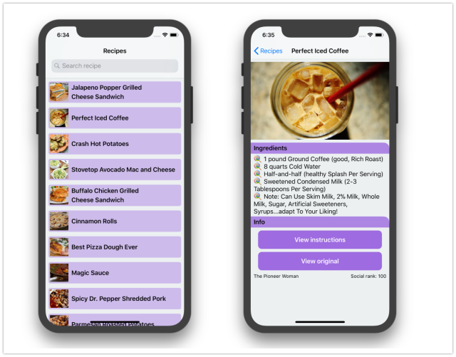
1

Getting started

Let’s decide on the tool and project settings that we use.

Xcode and Swift version

At WWDC 2018, Apple introduced Xcode 10 with Swift 4.2. However, at the time of writing, Xcode 10 is still in beta 5. So let’s stick with the stable Xcode 9 and Swift 4.1. Xcode 4.2 has some cool features — you can play with it through this awesome Playground. It does not introduce huge changes from Swift 4.1, so we can easily update our app in the near future if required.

You should set the Swift version in the Project setting instead of the target settings. This means all targets in the project share the same Swift version (4.1).
Minimum iOS version to support

As of summer 2018, iOS 12 is in public beta 5 and we can’t target iOS 12 without Xcode 10. In this post, we use Xcode 9 and the base SDK is iOS 11. Depending on the requirement and user bases, some apps need to support old iOS versions. Although iOS users tend to adopt new iOS versions faster than those who use Android, there are a some that stay with old versions. According to Apples advice, we need to support the two most recent versions, which are iOS 10 and iOS 11. As measured by the App Store on May 31, 2018, only 5% of users use iOS 9 and prior.
Targeting new iOS versions means we can take advantages of new SDKs, which Apple engineers improve every year. The Apple developer website has an improved change log view. Now it is easier to see what has been added or modified.

Ideally, to determine when to drop support for old iOS versions, we need analytics about how users use our app.

Organising the Xcode project

When we create the new project, select both “Include Unit Tests” and “Include UI Tests” as it a recommended practice to write tests early. Recent changes to the XCTest framework, especially in UI Tests, make testing a breeze and are pretty stable.
Before adding new files to the project, take a pause and think about the structure of your app. How do we want to organize the files? We have a few options. We can organize files by feature/module or role/types. Each has its pros and cons and I’ll discuss them below.

By role/type:

  • Pros: There is less thinking involved about where to put files. It’s also easier to apply scripts or filters.

  • Cons: It’s hard to correlate if we would want to find multiple files related to the same feature. It would also take time to reorganise files if we want to make them into reusable components in the future.

By feature/module

  • Pros: It makes everything modular and encourages composition.

  • Cons: It may get messy when many files of different types are bundled together.

Staying modular

Personally, I try to organize my code by features/components as much as possible. This makes it easier to identify related code to fix, and to add new features easier in the future. It answers the question “What does this app do?” instead of “What is this file?” Here is a good article regarding this.

A good rule of thumb is to stay consistent, no matter which structure you choose. 👍

Recipes app structure

The following is the app structure that our recipe app uses:

Source

Contains source code files, split into components:

  • Features: the main features in the app

  • Home: the home screen, showing a list of recipes and an open search

  • List: shows a list of recipes, including reloading a recipe and showing an empty view when a recipe does not exist

  • Search: handle search and debouncing

  • Detail: shows detail information

Library

Contains the core components of our application:

  • Flow: contains FlowController to manage flows

  • Adapter: generic data source for UICollectionView

  • Extension: convenient extensions for common operations

  • Model: The model in the app, parsed from JSON

Resource

Contains plist, resource, and Storyboard files.

Code conventions

I agree with most of the style guides in raywenderlich/swift-style-guide and github/swift-style-guide. These are straightforward and reasonable to use in a Swift project. Also, check out the official API Design Guidelines made by the Swift team at Apple on how to write better Swift code.

Whichever style guide you choose to follow, code clarity must be your most important goal.

Indentation and the tab-space war is a sensitive topic, but again, it depends on taste. I use four spaces indentation in Android projects, and two spaces in iOS and React. In this Recipes app, I follow consistent and easy-to-reason indentation, which I have written about here and here.

Documentation

Good code should explain itself clearly so you don’t need to write comments. If a chunk of code is hard to understand, it’s good to take a pause and refactor it to some methods with descriptive names so it’s the chunk of code is more clear to understand. However, I find documenting classes and methods are also good for your coworkers and future self. According to the Swift API design guidelines,

Write a documentation comment for every declaration. Insights gained by writing documentation can have a profound impact on your design, so don’t put it off.

It’s very easy to generate comment template /// in Xcode with Cmd+Alt+/ . If you plan to refactor your code to a framework to share with others in the future, tools like jazzy can generate documentation so other people can follow along.

Marking sections of code

The use of MARK can be helpful to separate sections of code. It also groups functions nicely in the Navigation Bar. You can also use extension groups, related properties and methods.

For a simple UIViewController we can possible define the following MARKs:

// MARK: - Init
// MARK: - View life cycle
// MARK: - Setup
// MARK: - Action
// MARK: - Data

Source control

Git is a popular source control system right now. We can use the template .gitignore file from gitignore.io/api/swift. There are both pros and cons in checking in dependencies files (CocoaPods and Carthage). It depends on your project, but I tend to not commit dependencies (node_modules, Carthage, Pods) in source control to not clutter the code base. It also makes reviewing Pull requests easier.

Whether or not you check in the Pods directory, the Podfile and Podfile.lock should always be kept under version control.

I use both iTerm2 to execute commands and Source Tree to view branches and staging.

Dependencies

I have used third party frameworks, and also made and contributed to open source a lot. Using a framework gives you a boost at the start, but it can also limit you a lot in the future. There may be some trivial changes that are very hard to work around. The same thing happens when using SDKs. My preference is to pick active open source frameworks. Read the source code and check frameworks carefully, and consult with your team if you plan to use them. A bit of extra caution does no harm.

In this app, I try to use as few dependencies as possible. Just enough to demonstrate how to manage dependencies. Some experienced developers may prefer Carthage, a dependency manager as it gives you complete control. Here I choose CocoaPods because its easy to use, and it has worked great so far.

There’s a file called .swift-version of value 4.1 in the root of the project to tell CocoaPods that this project uses Swift 4.1. This looks simple but took me quite some time to figure out. ☹️

Getting into the project

Let’s craft some launch images and icons to give the project a nice look.

API

The easy way to learn iOS networking is through public free API services. Here I use food2fork. You can register for an account at http://food2fork.com/about/api. There are many other awesome APIs in this public-api repository.

It’s good to keep your credentials in a safe place. I use 1Password to generate and store my passwords.

Before we start coding, let’s play with the APIs to see which kinds of requests they require and responses they return. I use the Insomnia tool to test and analyze API responses. It’s open source, free, and works great. 👍
Launch screen

The first impression is important, so is the Launch Screen. The preferred way is using LaunchScreen.storyboard instead of a static Launch image.

To add a launch image to Asset Catalog, open LaunchScreen.storyboard, add UIImageView , and pin it to the edges of UIView. We should not pin the image to the Safe Area as we want the image to be full screen. Also, unselect any margins in the Auto Layout constraints. Set the contentMode of the UIImageView as Aspect Fill so it stretches with the correct aspect ratio.
Configure layout in LaunchScreen.Configure layout in LaunchScreen.

App icon

A good practice is to provide all the necessary app icons for each device that you support, and also for places like Notification, Settings, and Springboard. Make sure each image has no transparent pixels, otherwise it results in a black background. This tip is from Human Interface Guidelines - App Icon.

Keep the background simple and avoid transparency. Make sure your icon is opaque, and don’t clutter the background. Give it a simple background so it doesn’t overpower other app icons nearby. You don’t need to fill the entire icon with content.

We need to design square images with a size greater than 1024 x 1024 so each is able to downscale to smaller images. You can do this by hand, script, or use this small IconGenerator app that I made.

The IconGenerator app can generate icons for iOS in iPhone, iPad, macOS and watchOS apps. The result is the AppIcon.appiconset that we can drag right into the Asset Catalog. Asset Catalog is the way to go for modern Xcode projects.
Linting code with SwiftLint

Regardless of what platform we develop on, it’s good to have a linter to enforce consistent conventions. The most popular tool for Swift projects is SwiftLint, made by the awesome people at Realm.

To install it, add pod ‘SwiftLint’, ‘~> 0.25’ to the Podfile. It’s also a good practice to specify the version of the dependencies so pod install won’t accidentally update to a major version that could break your app. Then add a .swiftlint.yml with your preferred configuration. A sample configuration can be found here.

Finally, add a new Run Script Phrase to execute swiftlint after compiling.
Type-safe resource

I use R.swift to safely manage resources. It can generate type-safe classes to access font, localisable strings, and colors. Whenever we change resource file names, we get compile errors instead of a implicit crash. This prevents us inferring with resources that are actively in use.

imageView.image = R.image.notFound()

Show me the code

Let’s dive into the code, starting with the model, flow controllers and service classes.

Designing the model

It may sound boring but clients are just a prettier way to represent the API response. The model is perhaps the most basic thing and we use it a lot in the app. It plays such an important role but there can be some obvious bugs related to malformed models and assumptions about how a model should be parsed that need to be considered.

We should test for every model of the app. Ideally, we need automated testing of models from API responses in case the model has changed from the backend.

Starting from Swift 4.0, we can conform our model to Codable to easily serialise to and from JSON. Our Model should be immutable:

struct Recipe: Codable {
  let publisher: String
  let url: URL
  let sourceUrl: String
  let id: String
  let title: String
  let imageUrl: String
  let socialRank: Double
  let publisherUrl: URL

enum CodingKeys: String, CodingKey {
    case publisher
    case url = "f2f_url"
    case sourceUrl = "source_url"
    case id = "recipe_id"
    case title
    case imageUrl = "image_url"
    case socialRank = "social_rank"
    case publisherUrl = "publisher_url"
  }
}

We can use some test frameworks if you like fancy syntax or an RSpec style. Some third party test frameworks may have issues. I find XCTest good enough.

import XCTest
@testable import Recipes

class RecipesTests: XCTestCase {
  func testParsing() throws {
    let json: [String: Any] = [
      "publisher": "Two Peas and Their Pod",
      "f2f_url": "http://food2fork.com/view/975e33",
      "title": "No-Bake Chocolate Peanut Butter Pretzel Cookies",
      "source_url": "http://www.twopeasandtheirpod.com/no-bake-chocolate-peanut-butter-pretzel-cookies/",
      "recipe_id": "975e33",
      "image_url": "http://static.food2fork.com/NoBakeChocolatePeanutButterPretzelCookies44147.jpg",
      "social_rank": 99.99999999999974,
      "publisher_url": "http://www.twopeasandtheirpod.com"
    ]

let data = try JSONSerialization.data(withJSONObject: json, options: [])
    let decoder = JSONDecoder()
    let recipe = try decoder.decode(Recipe.self, from: data)

XCTAssertEqual(recipe.title, "No-Bake Chocolate Peanut Butter Pretzel Cookies")
    XCTAssertEqual(recipe.id, "975e33")
    XCTAssertEqual(recipe.url, URL(string: "http://food2fork.com/view/975e33")!)
  }
}

Better navigation with FlowController

Before, I used Compass as a routing engine in my projects, but over time I’ve found that writing simple Routing code works too.

The FlowController is used to manage many UIViewController related components to a common feature. You may want to read FlowController and Coordinator for other use cases and to get a better understanding.

There is the AppFlowController that manages changing rootViewController. For now it starts the RecipeFlowController.

window = UIWindow(frame: UIScreen.main.bounds)
window?.rootViewController = appFlowController
window?.makeKeyAndVisible()
appFlowController.start()

RecipeFlowController manages (in fact it is) the UINavigationController, that handles pushing HomeViewController, RecipesDetailViewController, SafariViewController.

final class RecipeFlowController: UINavigationController {
  /// Start the flow
  func start() {
    let service = RecipesService(networking: NetworkService())
    let controller = HomeViewController(recipesService: service)
    viewControllers = [controller]
    controller.select = { [weak self] recipe in
      self?.startDetail(recipe: recipe)
    }
  }

private func startDetail(recipe: Recipe) {}
  private func startWeb(url: URL) {}
}

The UIViewController can use delegate or closure to notify FlowController about changes or next screens in the flow. For delegate there may be a need to check when there are two instances of the same class. Here we use closurefor simplicity.

Auto Layout

Auto Layout has been around since iOS 5, it gets better each year. Although some people still have a problem with it, mostly because of confusing breaking constraints and performance, but personally, I find Auto Layout to be good enough.

I try to use Auto Layout as much as possible to make an adaptive UI. We can use libraries like Anchors to do declarative and fast Auto Layout. However in this app, we’ll just use the NSLayoutAnchor since it is from iOS 9. The code below is inspired by Constraint. Remember that Auto Layout in its simplest form involves toggling translatesAutoresizingMaskIntoConstraints and activating isActive constraints.

extension NSLayoutConstraint {
  static func activate(_ constraints: [NSLayoutConstraint]) {
    constraints.forEach {
      ($0.firstItem as? UIView)?.translatesAutoresizingMaskIntoConstraints = false
      $0.isActive = true
    }
  }
}

There are actually many other layout engines available on GitHub. To get a sense over which one would be suitable to use, check out the LayoutFrameworkBenchmark.
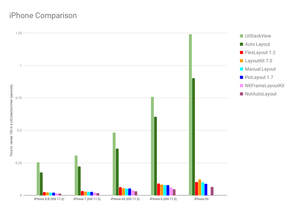
Architecture

Architecture is probably the most hyped and discussed topic. I’m a fan of exploring architectures, you can view more posts and frameworks about different architectures here.

To me, all architectures and patterns define roles for each object and how to connect them. Remember these guiding principles for your choice of architecture:

  • encapsuate what varies

  • favor composition over inheritance

  • program to interface, not to implementation

After playing around with many different architectures, with and without Rx, I found out that simple MVC is good enough. In this simple project, there is just UIViewController with logic encapsulated in helper Service classes,

Massive View Controller

You may have heard people joking about how massive UIViewController is, but in reality, there is no massive view controller. It’s just us writing bad code. However there are ways to slim it down.

In the recipes app I use,

  • Service to inject into the view controller to perform a single task

  • Generic View to move view and controls declaration to the View layer

  • Child view controller to compose child view controllers to build more features

Here is a very good article with 8 tips to slim down big controllers.

Access Control

The SWIFT documentation mentions that “access control restricts access to parts of your code from code in other source files and modules. This feature enables you to hide the implementation details of your code, and to specify a preferred interface through which that code can be accessed and used.”

Everything should be private and final by default. This also helps the compiler. When seeing a public property, we need to search for it across the project before doing anything further with it. If the property is used only within a class, making it private means we don’t need to care if it breaks elsewhere.

Declare properties as final where possible.

final class HomeViewController: UIViewController {}

Declare properties as private or at least private(set).

final class RecipeDetailView: UIView {
  private let scrollableView = ScrollableView()
  private(set) lazy var imageView: UIImageView = self.makeImageView()
}

Lazy properties

For properties that can be accessed at a later time, we can declare them as lazyand can use closure for fast construction.

final class RecipeCell: UICollectionViewCell {
  private(set) lazy var containerView: UIView = {
    let view = UIView()
    view.clipsToBounds = true
    view.layer.cornerRadius = 5
    view.backgroundColor = Color.main.withAlphaComponent(0.4)

return view
  }()
}

We can also use make functions if we plan to reuse the same function for multiple properties.

final class RecipeDetailView: UIView {
  private(set) lazy var imageView: UIImageView = self.makeImageView()

private func makeImageView() -> UIImageView {
    let imageView = UIImageView()
    imageView.contentMode = .scaleAspectFill
    imageView.clipsToBounds = true
    return imageView
  }
}

This also matches advice from Strive for Fluent Usage.

Begin names of factory methods with “make”, For example, x.makeIterator().

Code snippets

Some code syntax is hard to remember. Consider using code snippets to auto generate code. This is supported by Xcode and is the preferred way by Apple engineers when they demo.

if #available(iOS 11, *) {
  viewController.navigationItem.searchController = searchController
  viewController.navigationItem.hidesSearchBarWhenScrolling = false
} else {
  viewController.navigationItem.titleView = searchController.searchBar
}

I made a repo with some useful Swift snippets that many enjoy using.

Networking

Networking in Swift is kind of a solved problem. There are tedious and error-prone tasks like parsing HTTP responses, handling request queues, handling parameter queries. I’ve seen bugs about PATCH requests, lowercased HTTP methods, … We can just use Alamofire. There’s no need to waste time here.

For this app, since it’s simple and to avoid unnecessary dependencies. We can just use URLSession directly. A resource usually contains URL, path, parameters and the HTTP method.

struct Resource {
  let url: URL
  let path: String?
  let httpMethod: String
  let parameters: [String: String]
}

A simple network service can just parse Resource to URLRequest and tells URLSession to execute

final class NetworkService: Networking {
  @discardableResult func fetch(resource: Resource, completion: @escaping (Data?) -> Void) -> URLSessionTask? {
    guard let request = makeRequest(resource: resource) else {
      completion(nil)
      return nil
    }

let task = session.dataTask(with: request, completionHandler: { data, _, error in
      guard let data = data, error == nil else {
        completion(nil)
        return
      }

completion(data)
    })

task.resume()
    return task
  }
}

Use dependency injection. Allow caller to specify URLSessionConfiguration. Here we make use of Swift default parameter to provide the most common option.

init(configuration: URLSessionConfiguration = URLSessionConfiguration.default) {
  self.session = URLSession(configuration: configuration)
}

I also use URLQueryItem which was from iOS 8. It makes parsing parameters to query items nice and less tedious.

How to test Networking code

We can use URLProtocol and URLCache to add a stub for network responses or we can use frameworks like Mockingjay which swizzles URLSessionConfiguration.

I myself prefer using the protocol to test. By using the protocol, the test can create a mock request to provide a stub response.

protocol Networking {
  @discardableResult func fetch(resource: Resource, completion: @escaping (Data?) -> Void) -> URLSessionTask?
}

final class MockNetworkService: Networking {
  let data: Data
  init(fileName: String) {
    let bundle = Bundle(for: MockNetworkService.self)
    let url = bundle.url(forResource: fileName, withExtension: "json")!
    self.data = try! Data(contentsOf: url)
  }

func fetch(resource: Resource, completion: @escaping (Data?) -> Void) -> URLSessionTask? {
    completion(data)
    return nil
  }
}

Implementing cache for offline support

I used to contribute and use a library called Cache a lot. What we need from a good cache library is memory and disk cache, memory for fast access, disk for persistency. When we save, we save to both memory and disk. When we load, if memory cache fails, we load from disk, then update memory again. There are many advanced topics about cache like purging, expiry, access frequency. Have a read about them here.

In this simple app, a homegrown cache service class is enough and a good way to learn how caching works. Everything in Swift can be converted to Data, so we can just save Data to cache. Swift 4 Codable can serialize object to Data.

The code below shows us how to use FileManager for disk cache.

/// Save and load data to memory and disk cache
final class CacheService {

/// For get or load data in memory
  private let memory = NSCache<NSString, NSData>()

/// The path url that contain cached files (mp3 files and image files)
  private let diskPath: URL

/// For checking file or directory exists in a specified path
  private let fileManager: FileManager

/// Make sure all operation are executed serially
  private let serialQueue = DispatchQueue(label: "Recipes")

init(fileManager: FileManager = FileManager.default) {
    self.fileManager = fileManager
    do {
      let documentDirectory = try fileManager.url(
        for: .documentDirectory,
        in: .userDomainMask,
        appropriateFor: nil,
        create: true
      )
      diskPath = documentDirectory.appendingPathComponent("Recipes")
      try createDirectoryIfNeeded()
    } catch {
      fatalError()
    }
  }

func save(data: Data, key: String, completion: (() -> Void)? = nil) {
    let key = MD5(key)

serialQueue.async {
      self.memory.setObject(data as NSData, forKey: key as NSString)
      do {
        try data.write(to: self.filePath(key: key))
        completion?()
      } catch {
        print(error)
      }
    }
  }
}

To avoid malformed and very long file names, we can hash them. I use MD5 from SwiftHash, which gives dead simple usage let key = MD5(key).

How to test Cache

Since I design Cache operations to be asynchronous, we need to use test expectation. Remember to reset the state before each test so the previous test state does not interfere with the current test. The expectation in XCTestCase makes testing asynchronous code easier than ever. 👍

class CacheServiceTests: XCTestCase {
  let service = CacheService()

override func setUp() {
    super.setUp()

try? service.clear()
  }

func testClear() {
    let expectation = self.expectation(description: #function)
    let string = "Hello world"
    let data = string.data(using: .utf8)!

service.save(data: data, key: "key", completion: {
      try? self.service.clear()
      self.service.load(key: "key", completion: {
        XCTAssertNil($0)
        expectation.fulfill()
      })
    })

wait(for: [expectation], timeout: 1)
  }
}

Loading remote Images

I also contribute to Imaginary so I know a bit about how it works. For remote images, we need to download and cache it, and the cache key is usually the URL of the remote image.

In our recipese app, let’s build a simple ImageService based on our NetworkService and CacheService. Basically an image is just a network resource that we download and cache. We prefer composition so we’ll include NetworkService and CacheService into ImageService.

/// Check local cache and fetch remote image
final class ImageService {

private let networkService: Networking
  private let cacheService: CacheService
  private var task: URLSessionTask?

init(networkService: Networking, cacheService: CacheService) {
    self.networkService = networkService
    self.cacheService = cacheService
  }
}

We usually have UICollectionViewand UITableView cells with UIImageView. And since cells are reused, we need to cancel any existing request task before making a new request.

func fetch(url: URL, completion: @escaping (UIImage?) -> Void) {
  // Cancel existing task if any
  task?.cancel()

// Try load from cache
  cacheService.load(key: url.absoluteString, completion: { [weak self] cachedData in
    if let data = cachedData, let image = UIImage(data: data) {
      DispatchQueue.main.async {
        completion(image)
      }
    } else {
      // Try to request from network
      let resource = Resource(url: url)
      self?.task = self?.networkService.fetch(resource: resource, completion: { networkData in
        if let data = networkData, let image = UIImage(data: data) {
          // Save to cache
          self?.cacheService.save(data: data, key: url.absoluteString)
          DispatchQueue.main.async {
            completion(image)
          }
        } else {
          print("Error loading image at \(url)")
        }
      })

self?.task?.resume()
    }
  })
}

Making image loading more convenient for UIImageView

Let’s add an extension to UIImageView to set the remote image from the URL. I use associated object to keep this ImageService and to cancel old requests. We make good use of associated object to attach ImageService to UIImageView. The point is to cancel the current request when the request is triggered again. This is handy when the image views are rendered in a scrolling list.

extension UIImageView {
  func setImage(url: URL, placeholder: UIImage? = nil) {
    if imageService == nil {
      imageService = ImageService(networkService: NetworkService(), cacheService: CacheService())
    }

self.image = placeholder
    self.imageService?.fetch(url: url, completion: { [weak self] image in
      self?.image = image
    })
  }

private var imageService: ImageService? {
    get {
      return objc_getAssociatedObject(self, &AssociateKey.imageService) as? ImageService
    }
    set {
      objc_setAssociatedObject(
        self,
        &AssociateKey.imageService,
        newValue,
        objc_AssociationPolicy.OBJC_ASSOCIATION_RETAIN_NONATOMIC
      )
    }
  }
}

Generic DataSource for UITableView and UICollectionView

We use UITableView and UICollectionView in almost in every app and almost perform the same thing repeatedly.

  • show refresh control while loading

  • reload list in case of data

  • show error in case of failure.

There are many wrappers around UITableView and UICollection. Each adds another layer of abstraction, which gives us more power but applies restrictions at the same time.

In this app, I use Adapter to get a generic data source, to make a type safe collection. Because, in the end, all we need is to map from the model to the cells.

I also utilize Upstream based on this idea. It’s hard to wrap around UITableView and UICollectionView, as many times, it is app specific, so a thin wrapper like Adapter is enough.

final class Adapter<T, Cell: UICollectionViewCell>: NSObject,
UICollectionViewDataSource, UICollectionViewDelegateFlowLayout {
  var items: [T] = []
  var configure: ((T, Cell) -> Void)?
  var select: ((T) -> Void)?
  var cellHeight: CGFloat = 60
}

Controller and View

I ditched Storyboard because of many limitations and many issues. Instead, I use code to make views and define constraints. It is not that hard to follow. Most of the boilerplate code in UIViewController is for creating views and configuring the layout. Let’s move those to the view. You can read more about that here.

/// Used to separate between controller and view
class BaseController<T: UIView>: UIViewController {
  let root = T()

override func loadView() {
    view = root
  }
}

final class RecipeDetailViewController: BaseController<RecipeDetailView> {}

Handling responsibilities with a child View Controller

The View controller container is a powerful concept. Each view controller has a separation of concern and can be composed together to create advanced features. I have used RecipeListViewController to manage the UICollectionView and show a list of recipes.

final class RecipeListViewController: UIViewController {
  private(set) var collectionView: UICollectionView!
  let adapter = Adapter<Recipe, RecipeCell>()
  private let emptyView = EmptyView(text: "No recipes found!")
}

There is the HomeViewController which embeds this RecipeListViewController

/// Show a list of recipes
final class HomeViewController: UIViewController {

/// When a recipe get select
  var select: ((Recipe) -> Void)?

private var refreshControl = UIRefreshControl()
  private let recipesService: RecipesService
  private let searchComponent: SearchComponent
  private let recipeListViewController = RecipeListViewController()
}

Composition and Dependency Injection

I try to build components and compose code whenever I can . We see that ImageService makes use of the NetworkService and CacheService, and RecipeDetailViewController makes use of Recipe and RecipesService

Ideally objects should not create dependencies by themselves. The dependencies should be created outside and passed down from root. In our app the root is AppDelegate and AppFlowController so dependencies should start from here.

App Transport Security

Since iOS 9, all apps should adopt App Transport Security

App Transport Security (ATS) enforces best practices in the secure connections between an app and its back end. ATS prevents accidental disclosure, provides secure default behavior, and is easy to adopt; it is also on by default in iOS 9 and OS X v10.11. You should adopt ATS as soon as possible, regardless of whether you’re creating a new app or updating an existing one.

In our app, some images are obtained over an HTTP connection. We need to exclude it from the security rule, but only for that domain only.

<key>NSAppTransportSecurity</key>
<dict>
  <key>NSExceptionDomains</key>
  <dict>
    <key>food2fork.com</key>
    <dict>
      <key>NSIncludesSubdomains</key>
      <true/>
      <key>NSExceptionAllowsInsecureHTTPLoads</key>
      <true/>
    </dict>
  </dict>
</dict>

A custom Scrollable View

For the detail screen, we can use UITableView and UICollectionView with different cell types. Here, the views should be static. We can stack using UIStackView. For more flexibility, we can just use UIScrollView.

/// Vertically layout view using Auto Layout in UIScrollView
final class ScrollableView: UIView {
  private let scrollView = UIScrollView()
  private let contentView = UIView()

override init(frame: CGRect) {
    super.init(frame: frame)

scrollView.showsHorizontalScrollIndicator = false
    scrollView.alwaysBounceHorizontal = false
    addSubview(scrollView)

scrollView.addSubview(contentView)

NSLayoutConstraint.activate([
      scrollView.topAnchor.constraint(equalTo: topAnchor),
      scrollView.bottomAnchor.constraint(equalTo: bottomAnchor),
      scrollView.leftAnchor.constraint(equalTo: leftAnchor),
      scrollView.rightAnchor.constraint(equalTo: rightAnchor),

contentView.topAnchor.constraint(equalTo: scrollView.topAnchor),
      contentView.bottomAnchor.constraint(equalTo: scrollView.bottomAnchor),
      contentView.leftAnchor.constraint(equalTo: leftAnchor),
      contentView.rightAnchor.constraint(equalTo: rightAnchor)
    ])
  }
}

We pin the UIScrollView to the edges. We pin the contentView left and right anchor to self, while pinning the contentView top and bottom anchor to UIScrollView.

The views inside contentView have top and bottom constraints, so when they expand, they expand contentView as well. UIScrollView uses Auto Layout info from this contentView to determine its contentSize. Here is how ScrollableView is used in RecipeDetailView.

scrollableView.setup(pairs: [
  ScrollableView.Pair(view: imageView, inset: UIEdgeInsets(top: 8, left: 0, bottom: 0, right: 0)),
  ScrollableView.Pair(view: ingredientHeaderView, inset: UIEdgeInsets(top: 8, left: 0, bottom: 0, right: 0)),
  ScrollableView.Pair(view: ingredientLabel, inset: UIEdgeInsets(top: 4, left: 8, bottom: 0, right: 0)),
  ScrollableView.Pair(view: infoHeaderView, inset: UIEdgeInsets(top: 4, left: 0, bottom: 0, right: 0)),
  ScrollableView.Pair(view: instructionButton, inset: UIEdgeInsets(top: 8, left: 20, bottom: 0, right: 20)),
  ScrollableView.Pair(view: originalButton, inset: UIEdgeInsets(top: 8, left: 20, bottom: 0, right: 20)),
  ScrollableView.Pair(view: infoView, inset: UIEdgeInsets(top: 16, left: 0, bottom: 20, right: 0))
])

Adding search functionality

From iOS 8 onwards, we can use the UISearchController to get a default search experience with the search bar and results controller. We’ll encapsuate search functionality into SearchComponent so that it can be pluggable.

final class SearchComponent: NSObject, UISearchResultsUpdating, UISearchBarDelegate {
  let recipesService: RecipesService
  let searchController: UISearchController
  let recipeListViewController = RecipeListViewController()
}

Starting from iOS 11, there ‘s a property called searchController on the UINavigationItem which makes it easy to show the search bar on the navigation bar.

func add(to viewController: UIViewController) {
  if #available(iOS 11, *) {
    viewController.navigationItem.searchController = searchController
    viewController.navigationItem.hidesSearchBarWhenScrolling = false
  } else {
    viewController.navigationItem.titleView = searchController.searchBar
  }

viewController.definesPresentationContext = true
}

In this app, we need to disable hidesNavigationBarDuringPresentation for now, as it is quite buggy. Hopefully it gets resolved in future iOS updates.

Understanding Presentation context

Understanding presentation context is crucial for view controller presentation. In search, we use the searchResultsController.

self.searchController = UISearchController(searchResultsController: recipeListViewController)

We need to use definesPresentationContext on the source view controller (the view controller where we add the search bar into). Without this we get the searchResultsController to be presented over full screen !!!

When using the currentContext or overCurrentContext style to present a view controller, this property controls which existing view controller in your view controller hierarchy is actually covered by the new content. When a context-based presentation occurs, UIKit starts at the presenting view controller and walks up the view controller hierarchy. If it finds a view controller whose value for this property is true, it asks that view controller to present the new view controller. If no view controller defines the presentation context, UIKit asks the window’s root view controller to handle the presentation.
The default value for this property is false. Some system-provided view controllers, such as UINavigationController, change the default value to true.

Debouncing search actions

We should not execute search requests for every key stroke the user types in the search bar. Therefore some kind of throttling is needed. We can use DispatchWorkItem to encapsulate the action and send it to the queue. Later we can cancel it.

final class Debouncer {
  private let delay: TimeInterval
  private var workItem: DispatchWorkItem?

init(delay: TimeInterval) {
    self.delay = delay
  }

/// Trigger the action after some delay
  func schedule(action: @escaping () -> Void) {
    workItem?.cancel()
    workItem = DispatchWorkItem(block: action)
    DispatchQueue.main.asyncAfter(deadline: .now() + delay, execute: workItem!)
  }
}

Testing debouncing with Inverted expectation

To test Debouncer we can use XCTest expectation in inverted mode. Read more about it in Unit testing asynchronous Swift code.

To check that a situation does not occur during testing, create an expectation that is fulfilled when the unexpected situation occurs, and set its isInverted property to true. Your test will fail immediately if the inverted expectation is fulfilled.

class DebouncerTests: XCTestCase {
  func testDebouncing() {
    let cancelExpectation = self.expectation(description: "cancel")
    cancelExpectation.isInverted = true

let completeExpectation = self.expectation(description: "complete")
    let debouncer = Debouncer(delay: 0.3)

debouncer.schedule {
      cancelExpectation.fulfill()
    }

debouncer.schedule {
      completeExpectation.fulfill()
    }

wait(for: [cancelExpectation, completeExpectation], timeout: 1)
  }
}

Testing user interface with UITests

Sometimes small refactoring can have a large effect. A disabled button can lead to unusable screens afterward. UITest helps ensuring integrity and functional aspects of the app. Test should be declarative. We can use the Robot pattern.

class RecipesUITests: XCTestCase {
  var app: XCUIApplication!

  override func setUp() {
    super.setUp()
    continueAfterFailure = false

    app = XCUIApplication()
  }

  func testScrolling() {
    app.launch()

    let collectionView = app.collectionViews.element(boundBy: 0)
    collectionView.swipeUp()
    collectionView.swipeUp()
  }

  func testGoToDetail() {
    app.launch()

    let collectionView = app.collectionViews.element(boundBy: 0)
    let firstCell = collectionView.cells.element(boundBy: 0)
    firstCell.tap()
  }
}

Here are some of my articles regarding testing.

Main thread guard

Accessing the UI from the background queue can lead to potential problems. Earlier, I needed to use MainThreadGuard, now that Xcode 9 has Main Thread Checker, I just enabled that in Xcode.

The Main Thread Checker is a standalone tool for Swift and C languages that detects invalid usage of AppKit, UIKit, and other APIs on a background thread. Updating UI on a thread other than the main thread is a common mistake that can result in missed UI updates, visual defects, data corruptions, and crashes.
Measuring performances and issues

We can use Instruments to thoroughly profile the app. For quick measurement, we can head over to the Debug Navigator tab and see CPU, Memory and Network usage. Check out this cool article to learn more about instruments.

Prototyping with Playground

Playground is the recommended way to prototype and build apps. At WWDC 2018, Apple introduced Create ML which supports Playground to train model. Check out this cool article to learn more about playground driven development in Swift.

Where to go from here

Thanks for making it this far. I hope you’ve learnt something useful. The best way to learn something is to just do it. If you happen to write the same code again and again, make it as a component. If a problem gives you a hard time, write about it. Share your experience with the world, you will learn a lot.


Original post https://medium.freecodecamp.org/learn-ios-best-practices-by-building-a-simple-recipes-app-9bcbce4d10d

Updated at 2021-01-01 23:26:13